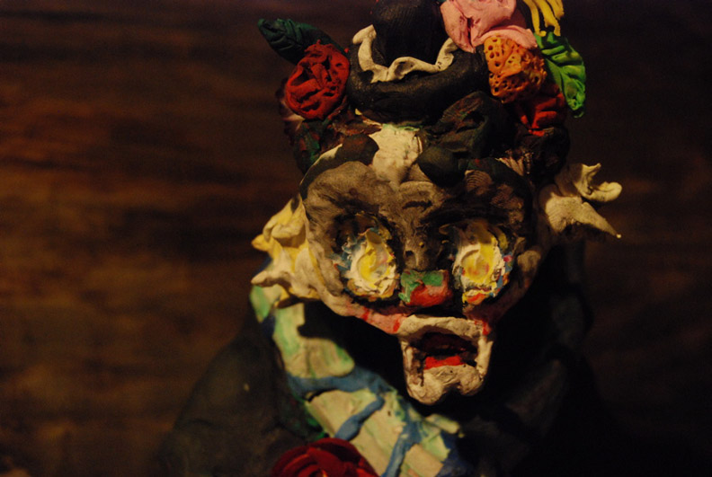
NAH POP NO STYLE @ Roots and Culture

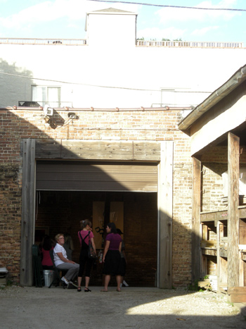
I first dropped by Roots and Culture’s latest show on opening night, squeezed past the crowd outside and poked my head over shoulders of an unusually tall crowd to see the art, decided the tide had turned to afterparty early, and ran out. While too much crowd to see art with both eyes, not bad for a space looking to engage the community.

Luckily what I did manage to see convinced me to make a return stop.
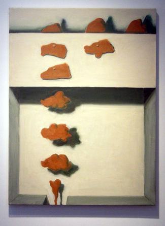
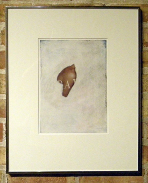
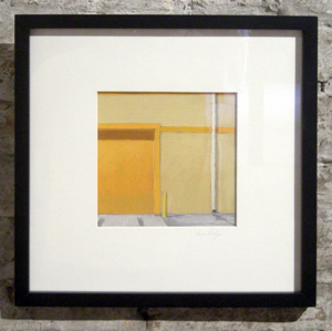
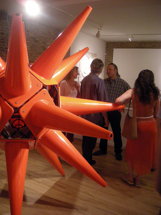
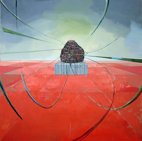
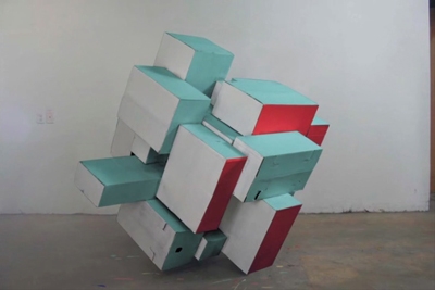
Clay Schiff, Nine and a Half Objects

Clay Schiff, Nine and a Half Objects

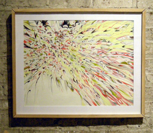
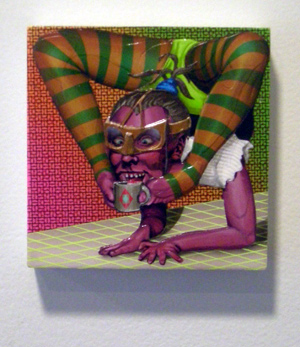
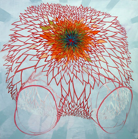
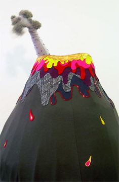
NAH POP NO STYLE features art – mostly paintings – from Providence and Baltimore. Despite the geographic differences, the work here tends to homogenize; there isn’t enough dramaticly different between the art out of Providence/RISD vs. Baltimore/MICA to see the work separate into camps. That doesn’t really matter, except to say that the show doesn’t have as much internal contrast as a two-city show might suggest.

Geography aside, the work in the gallery was some interesting stuff.
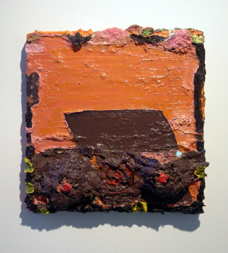
Anabeth Marks, Rumspringa

Annabeth Marks, Rumspringa

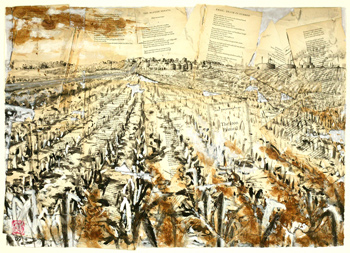
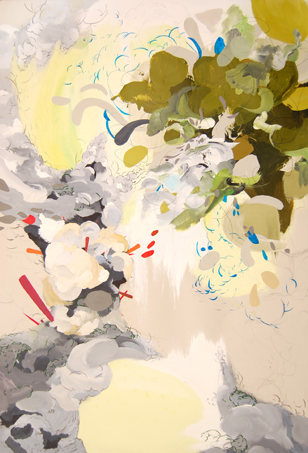
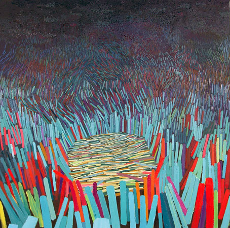
I’ll run through what I liked quickly: Annabeth Marks‘ paintings were grungy, clever abstractions that made pukey pallete-goo oil paint look less gross than, say, Kent Dorn‘s Figutives,  but more fuck-around-ish too. Clay Schiff’s work was more reserved, but made up for straightforward material use with excellent composition and color choices. Blade Wynne not only has one of the most bad assed names in the world, but his gouache paintings were very skilled, advanced pieces too. Wynne was definitely a standout in this show and someone I’d keep an eye on in the future.
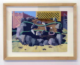
Blade Wynne, Garden

Blade Wynne, Garden

Lucy Campana’s work ended up using paint in a beautiful way, but for mediocre ends. I enjoyed her After Laughter Comes Tears up to the point where I recognized the profiles traced into the paint, at which time I tried hard to un-see them. The way she uses paint, I can imagine her work losing the pictorial or figurative elements and being better for it. Unfortunatey I have neither a photo or a link for Ms. Campana, so you’ll have to take my word on this.

(Update: You can see her work here.)
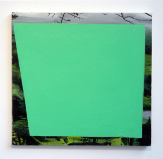
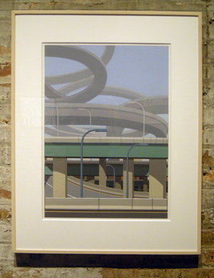
Quinn Taylor, (Untitled)

Quinn Taylor, (Untitled)

I liked Quinn Taylor’s two pieces both as works themselves and as foils to the work around them. The curatorial team (Michael Thibault and Hugh Zeigler) made good use of Taylor, and in turn Taylor’s pieces looked great in the show.
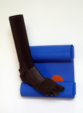
Chloe Wessner, The Last Walk

Chloe Wessner, The Last Walk

However much talent was on display at NAH POP NO STYLE, there was a new artist smell to some of the pieces, with work that seemed to spring from the art school structure rather than from a developed body of work. Chloe Wessner’s The Last Walk and Kandis Williams’ I Saw What You Did, Bitch (Cunty Whisper) both felt like one-off, pointed constructions. These may be other cases of wait and see.
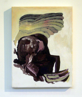
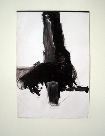
Thomas Harrington, Untitled

Thomas Harrington, Untitled

While there were few pieces I swallow whole, and despite minor problems with some pieces, NAH POP NO STYLE is still one of the most interesting shows up in Chicago right now. Thibault and Zeigler have put together a very balanced show, rich in content and interplay, honestly beautiful in the space, and with pieces that generated more opinions and discussion than most shows I’ve attended and/or discussed. I may go a third time.

I give it a:

7.6

NAH POP NO STYLE runs July 11th through August 8th @ Roots and Culture, 1034 N. Milkwaukee.

P.S. This was one of the more difficult articles to write, only because of the very sparse online content. I nearly wore out my googler trying to track down information for some of the artists involved in this show. While I can (only reluctantly) handle the gallery not putting up a piece list/images for the show, the artists themselves should really have some online presence for interested parties. If you’re an artist without a website, please, for my sake as well as your own, go set up a blog and put your name and work on it. Put a tiny bio. Include the word artist. For me. Please.

post to facebook

control c, control v @ ebersb9

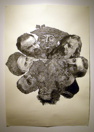
If you’ve been following Fecal Face‘s features this year and panting at work coming out of California, you’ll be happy to know that  Ebersb9‘s latest show control c, control v has brought lots of familiar Fecal Face featured (fecal?) faces to Chicago. This fecal feel probably has something to do with Ryan Travis Christian, sole contributor for Fecal Face’s Chicago bureau, local starlet, a person I once stole a killer painting from, and curator for control c, control v.

Alexis Mackenzie, Youthless

Alexis Mackenzie, Youthless

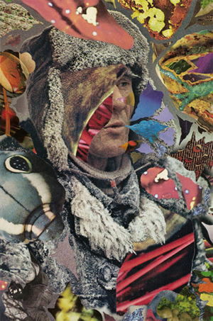
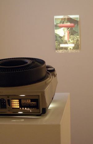
While a collage show, only half of the artists really take a direct and formal collage approach. Hilary PecisUntitled, Hisham Akira Bharoocha‘s All That Baggage, and Alexis Mackenzie‘s Youthless and Dust are all straighforward (at least in construction), whereas the other artists’ work feature a more collage of content rather than of form. In Eric Yahnker‘s Bearded Asterisk, the collage came before the drawing, chopped and composed digitally and reconstructed in graphite on the paper. Likewise, Bjorn Copeland‘s Kokomo and Tobacco/Beta Carnage’s Hawker Boat are both the kind of video collages you might wind up with whirling a razor in a local access hell-vault, composed of weird, surreal, and sort of familiar bits from just about everywhere.
Eric Yahnker, Beard Asterick

Eric Yahnker, Bearded Asterick

That slant towards extra eclecticism infects much of the art in the show. There is that certain aesthetic flavor to much of the work that is hard to name but easy to recognize. I’d call it psychedelic, but its visual intensity and chaotic content would be a hard microdot to swallow; no, this is closer to digital psychosis, a glitchy tour of shit culture with saturation at max, an intense absurdism. Its the flavor of Dan Deacon, Tim and Eric, of a purely aesthetic reading of Ulysses with 3D glasses on, and perhaps most crystally of the split second random commercial drop spliced between breaks of a show you recorded years ago on VHS. It feels very west coast, though its not entirely separate from the visual intensity and weirdo content of Chris Millar or Patrick Lundeen.
Whatever you want to call it, its here to see, more (see Pecis, Yahnker, and both video artists) or less (see Matt Irie’s Loomy Tombs) in every piece. Even Mackensie’s subdued natural collages have a hint of strange collission.

Hisha Akira Bharoocha

Hisha Akira Bharoocha, All That Baggage

By the way, I’m calling it drop culture.

Brion Nuda Rosch, White Mask/Mountain Mask

Brion Nuda Rosch, White Mask/Mountain Mask

Not only is this the strongest show yet at Ebersb9, control c, control v is really just way too good for being only the third opening at a brand new apartment gallery. Had Ryan and Sara and Dominic been given enough space to exhibit larger works from the same artists this show could easily compare to and compete with any exhibition currently in Chicago. As it is, control c, control v still packs in a solid group without overburdening the main space.

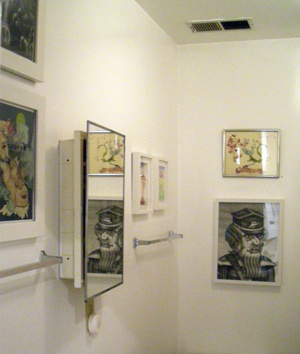
Though the backroom/bathroom is getting crowded.

The Artiest Bathroom in Chicago

The Artiest Bathroom in Chicago

I give it a:

8.53, give or take .01

control c, control v runs from July 17th to August 15th, 2009 @ Ebersb9, 1359 W. Chicago Ave.

post to facebook

Artphone: 360 SEE and Carrie Secrist Gallery

Another week, another two audio previews! My internet phone won’t stop internet ringing!

Fittingly, Works on and of Paper @ 360 SEE

Jordan from 360 SEE called in to talk about their’s new show, Fittingly, Works on and of Paper, which will kick off this Friday, July 17th, 6 – 9 PM, and run through to August 28th, at 1924 North Damen Avenue.

Curtis Frillmann, Iron Pastoral #2

Curtis Frillmann, Iron Pastoral #2

Matthew Brown @ Carrie Secrist

And here’s a clip from the Carrie Secrist Gallery about their show Ark, which features paintings by Matthew Brown. Show opens Friday, July 17th, and runs through August 15th, 2009 at 835 W Washington.

Matthew Brown, Untitled

Matthew Brown, Untitled (1934)

Update, July 20th:

I just went to Carrie Secrist and I didn’t this show at all. Whats going on?

post to facebook

Works on Paper Juried Exhibition @ Around the Coyote

The full title of this latest show from Around the Coyote (2nd Annual Joseph Frasca Memorial Works on Paper Juried Exhibition) may be all the introduction you need. This is indeed a works on paper exhibition, the second in as many years, and it is in memory of Joseph Frasca. If you haven’t read the history of Around the Coyote, spend a hot minute reading it here. For more recent history, including the exodus from the Flatiron Building to the Splat Flats spaces, dig through this juicy Chicago Reader article too.

Around the Coyote

Around the Coyote (not pictured: the Flat Iron building)

As interesting as the space’s story is, as with all things its what’s inside that counts. With so many artists represented, this exhibition brought pause and praise in the same breath – for a juried exhibition, there is a lot of work, but almost all of that work is well done or better, and reflected the polished, high aesthetic that has been sneaking into studios this year.

Its hard to complain, but I did feel the show as a whole would have breathed better had a few pieces been left out. If nothing else, the breadth of what Zg Gallery‘s Myra Casis and Meg Sheehy chose to juried in spoke to the amount of quality work that had been submitted, so ten points there to the artists.

Around the Coyote

Elizabeth Kauffman, Amoeba

Stephen Mishol, TAMP

Stephen Mishol, TAMP

Some highlights from the show include Stephen Mishol‘s painting TAMP (above), a baffling vinyl paint construction and one of the most eerily balanced compositions I’ve seen this summer, Kristin Reger‘s MothsHans Habeger‘s Composition with Orange Door, Susan Wolsborn‘s Housefire, and Josh Reame‘s Insatiable.

Those picks may seem slanted toward painting, but so was the show. And after all, what better surface for the young 21st century painter than paper, free from the presumptions of canvas and at a fraction of the cost? Crank out a hundred paintings, burn all but the ten best!

Kristen Reger, Moths

Kristin Reger, Moths

Composition with Orange Door

Hans Habeger, Composition with Orange Door

I liked this show and enjoyed almost all of the work included, though it could have been cut down a little. While satisfying on its own, it helps that two other galleries are having their own excellent summer shows just around the block, making Wicker Park / Noble Square a significant clutch of art this month.

I give it a:

8.2

The 2nd Annual Joseph Frasca Memorial Works on Paper Juried Exhibition runs July 11th, 2009 through August 15th, 2009 @ Around the Coyote, 1817 W. Division St.

post to facebook

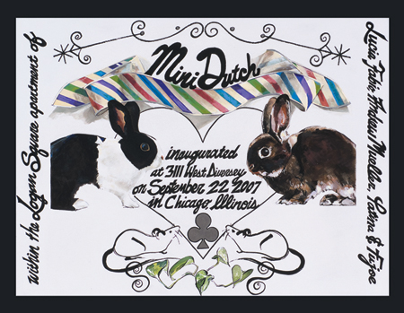
Selections from the Fabio-Mueller Collection @ Mini Dutch

Last Saturday saw the final show at Mini Dutch, Lucia Fabio‘s seasoned apartment gallery in Logan Square. Having ran the gallery for more than two years (a truly respectable amount of time for any alternative space), Lucia and her fiance Robert Mueller chose to close it out by exhibiting the art they’d personally collected along the way.

As sorry as it is to see a space like Mini Dutch go, all apartment gallery owners take note: if you’ve got to go out, this is the way to do it.

Lucia Fabio and Robert Mueller

Lucia Fabio and Robert Mueller

By some luck I arrived at the gallery early and despite my tics and ticks was graciously invited in to snap some pictures and chat and distract while the titular duo finished up the final points of the show. Though I missed the meat of the event – the memories and good-byes and champagne toasts – I was allowed a sunny private view of the work, which was a great thing indeed considering the art in the space.

I don’t think it would be entirely appropriate to critique a personal collection, so I’ll limit myself to congradulating Lucia on bringing the work out for us to see in a way that could have easily passed for a dream-team group show of Chicago artists. Many small and medium-sized works were presented here from artists like Chris Millar (who I’d call one of the the best artists living in the city at the moment), the soon-to-be-in-New-York Stacie Johnson (her new project named Wandering Caterpillar is well worth a look), E. C. Brown, Mark Porter, and many, many more.

Here are some pictures!

Chris Millar, Life Inside a Very Small Painting

Chris Millar, Life Inside a Very Small Painting

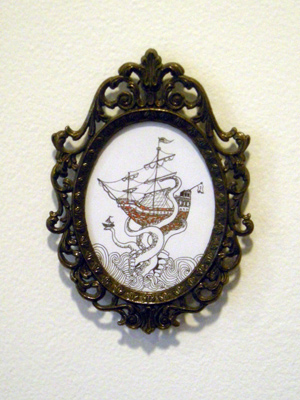
Andrew Holmquest, New Heart (The Bob Newhart Show)

Andrew Holmquest, New Heart (The Bob Newhart Show)

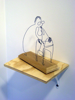
Blazo Calovic, Untitled

Blazo Calovic, Untitled

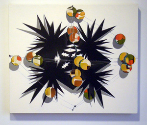
Stacie Johnson, Frontside: Starburst with Mirrors

Stacie Johnson, Frontside: Starburst with Mirrors

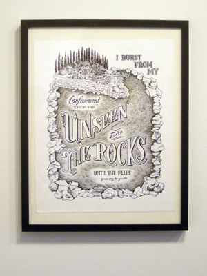
 Carol Jackson, I burst from my confinement then hid unseen amid the rocks until the flies gave way to gnats.

Carol Jackson, I burst from my confinement then hid unseen amid the rocks until the flies gave way to gnats.

I wish Lucia the best in her new place on the left coast and hope that if or when she ends up starting a new alternative (or more standard) space, she would choose to open it with this exact same show. It would be as perfect a Hello show in California as it was a Good-Bye show in Chicago. Good luck!

I give it a:

See ya!

Selections from the Fabio-Mueller Collection was held Saturday, July 11th at Mini Dutch, 3111 W. Diversy (1st floor apartment).

post to facebook

Size Matters! @ Packer Schopf

The problem with titling a show Size Matters! is that it places a dozen professional artists under the flipsy membrane of a cock joke. It also forces every reviewer to pun off of the title. So, while many of the pieces in this show did live up to the name in terms of scale, the double entendre must bite both ways:  if this latest show from Packer Schopf had a dick, it would have to be a pretty average sized dick.

Victoria Fuller, Safety Star

Victoria Fuller, Safety Star

I can appreciate the strategy as a way to make a bigger group show come together, but bringing out large-scale works just wasn’t enough here. Many pieces made no sense being next to eachother, and worse for a show hinging on large works, it was difficult to even appreciate any given piece’s scale because of the eleven other large pieces in the room. I would have liked to have seen some of the smaller works from other Packer Schopf artists brought upstairs to support the larger works, allowing for scale reference and visual play between pieces.

But while I didn’t enjoy the full presentation, many of the individual pieces were very solid. Doug Smithenry‘s Coming Out Online series was excellent to finally see in person and described an enormous, prodigious effort by the artist. Victoria Fuller and Michael T. Rea‘s sculptures ended up being more interactive than I expected, with the Safety Star acting as a megaphone echo chamber and Rea’s Sleeping Beauty being groped like an IKB to prove its sheen really was raw graphite.

Michael T. Rea, Sleeping Beauty

Michael T. Rea, Sleeping Beauty

The misses came in the form of high craft, low impact art objects such as Jud Bergeron‘s jig sculpture, or Catherine Jacobi‘s Mary. A few skated the purely decorative line, with Mark Crisanti‘s flying bird men (click here to see a writer struggle to puff Crisanti’s work) and Renee McGinnis‘ Merchandise Mart painting both being very pretty and pretty forgettable.

Size Matters! at Packer Schopf

Mark Crisanti at Packer Schopf

Despite its lapses, Size Matters! does earn a spot on any respectable West Loop gallery tour, though partially as an entry-way into the catacomb halls below, where the smaller treasures of Seeley and Dettmer and Wortendyke live. And the work upstairs isn’t really disappointing; If you can focus on one large work at a time upstairs, Size Matters! will reward you with some highly polished, pretty humorous work.

And unfortunately for us all, since someone is going to say it anyway I may as well be the first: its not the size of the work, its how you use it! Haha! At least the show was hung well, or was it well hung? Heyyooh! Pippen to Jordan!

I give it a:

6.9

Size Matters! runs July 10th, 2009 to August 15th, 2009 at Packer Schopf, 942 W. Lake.

post to facebook

Karolina Gnatowski @ Spoke

While many are busy bemoaning the stable review shows that are up for this summer, one shouldn’t get the impression that interesting art in Chicago takes the same vacation as the universities do. This weekend, crush in the heart of the West Loop’s 119 N. Peoria building (home to many local faves), the Spoke gallery hosted an epic performance by Karolina Gnatowski entitled In Memory Of…A Love Story.

Karolina Gnatowski, In Memory Of... A Love Story

Karolina Gnatowski, In Memory Of... A Love Story

A crowd of over thirty were packed into the front of the Spoke space, and when the lights went down Gnatowski’s show began. While best described as a puppet show, In Memory of… brought together all elements of a good show:  music (including a full play-through of Stairway to Heaven and a full-piped rendition of Harry Nilson’s Without You), high-proof whiskey (passed around the audience in the real and shot on stage in the fake), and weed (a legit spliff shared with a puppet), all laid over the most personality-driven artistic struts imaginable. The show was at parts endearing, painfully geeky, and erotically bizzare as anything Dutes could dream up a floor below.

If you’re waiting for me to get to what the performance was about, don’t hold your breath. The narrative itself, while perfectly appropriate as a vehicle for the performance, never really moved beyond that. It wasn’t a bad story, its just that the quality and content of the show was far more present in Gnatowski’s telling of the story than in the story she was telling. The craft and trick and gimmick and humor were the point.

But if you must know: it began with a horizontal gill flex, went to sea, fucked in hell, ended in heaven, and taught the moral that there is no loss so great that it can’t be danced off.

Karolina Gnatowski, In Memory Of... A Love Story

Karolina Gnatowski, In Memory Of... A Love Story

One side to this performance I appreciated, especially in light of those aformentioned summer stable shows that are dominating the west loop this summer, was the complete one-offness of the show. Her backdrops, which were very cool watercolor on paper paintings, were torn, folded, and pitched out the roof of her puppet-house for each scene change. Her puppets were declothed in an apparently irreversible way. It was advertised as a one-time performance, it really was, and in the dark with thirty other people and a bottle of whiskey I couldn’t stop thinking of how lucky I was to be there for it.

I give it a:

8.5

Karolina Gnatowski‘s In Memory Of… A Love Affair was performed July 10th, 2009 and (apparently, somehow) runs through July 31st, 2009 at Spoke, 119 N. Peoria.

post to facebook

Artphone: Mini Dutch / Around the Coyote

Not one but two audio pieces for this weekend’s shows!

Selections from the Fabio-Mueller Collection @ Mini Dutch

Lucia from Mini Dutch is having her last show ever tonight! Its always sad to see good apartment galleries go. I’ll let her tell the rest: Be sure to check out the send off Saturday, July 11th, 6 – 9 PM at 3111 W Diversey Parkway, 1st Floor.

Mini Dutch

Mini Dutch

2nd Annual Joseph Frasca Memorial Works on Paper Juried Exhibition @ Around the Coyote

Not to be outdone, here’s Anne from Around the Coyote giving us some key info on their works on paper show opening this Saturday, July 11th, 6 – 9 PM at 1817 W. Division Street:

Joshua Reames, Insatiable (at Around the Coyote)

Joshua Reames, Insatiable (at Around the Coyote)

post to facebook

Weekend Preview

While there are otherbetter places to get previews of weekend gallery openings and events, my recent exposure to Twitter feeds, press releases in my inbox, and clairvoyance (a power gained after being bitten by a radioactive clairvoyant) have all led logically to this: a weekend preview post. These are not top five lists or a listing of all reported gallery openings. These are simply events which I will attend, attempt to attend, or which I will attend astrally through radioactive projection.
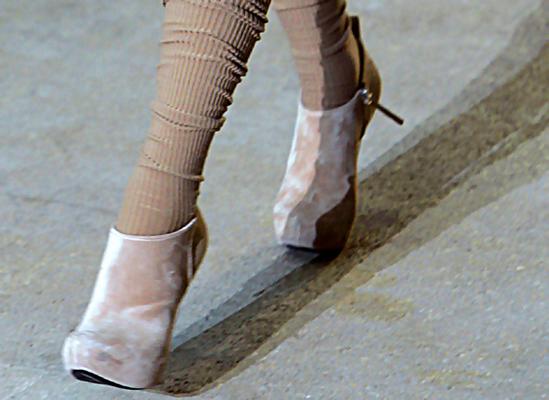
Keep an eye out for me, in these shoes, this weekend.

Keep an eye out for me, in these shoes, this weekend.

Summer Residents Exhibition @ Threewalls

Gitte Bog, Susan Lee-Chun, and Kang-hyun Ahn! A perfect opportunity for those who were turned down for residencies to grouse over Grolsch, and a far rarer opportunity to see artwork this summer that skips the market and heads straight for sewing checkerboard wallpaper. Opening this Friday the 10th, 6 – 9 PM at 119 N. Peoria.

Size Matters Packer Schopf

Potentially the biggest and best fuck-all group show of the summer, Aaron Packer has really packed his gallery full of work, including (among many others) a bebonered, Han Solo inspired self portrait in wooden carbonite by Mike Rea, selections from the Coming out Online project by Doug Smithenry (who recently asked me for tips about gouache, go figure), and some kind of epic stag hunt painting by Jenn Wilson. Opening Friday, July 10th from 5 – 8 PM at 942 W. Lake Street.

Greg Murr @ Perimeter

Watercolors from the only painter with the guts to paint a stack of dogs. Remember to bang your lids left when traveling in the River North district. Opening reception Friday, July 10th from 5 – 8 PM at 210 W. Superior.

Antoine Catala @ Tony Wight

Proving one show at a time that video art can sometimes kick all ass, Wight’s latest show features a techno-trippy fourth dimentional video portrait which you can watch right here. No opening reception, but it will go up on Saturday the 11th at 119 N Peoria.

Big Youth @ Corbett vs. Dempsey

Thirteen emerging painters. Don’t you love the summer? Opening Saturday, July 11th from 5 – 9 PM @ 1120 N. Ashland.

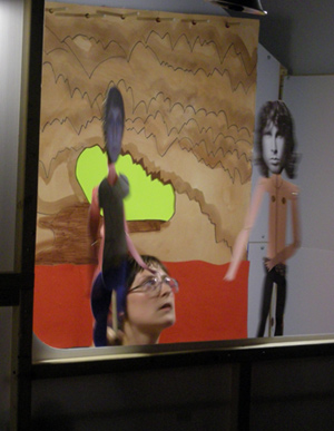
NAH POP NO STYLE @ Roots and Culture

A painting show (!!!) featuring eleven Baltimore and Providence artists. Opening Saturday, July 11th from  6 – 9 PM  at 1034 N. Milwaukee. As a bonus: Roots and Culture are also hosting at their location, at 9 PM, the after-party for Corbet vs. Dempsey‘s current show, Big Youth. This is the place to be Saturday night.

And that’s all that I’m really excited about. Protip, galleries: if you’re having a reception, why not put those details online?

post to facebook

Summer Show @ Antena

There are three artists showing this summer at  Antenna, a gallery ran by Miguel Cortez of Polvo fame. The first and most immediatey recognizable in the space is Saul Aguirre, whose immaculately framed drawings occupy two large walls in grids; the second is Yarima Ariza, who has come out of the Floridian woodwork with new fiber works; and the last is the nearly invisible, did-realize-she-was-even-in-the-show-until-I-went-online, Adriana Baltazar, whose work I’m pretty sure I saw but I can’t be sure what I think I saw was actually hers or not so I’m sorry, Adriana, I fucked up.

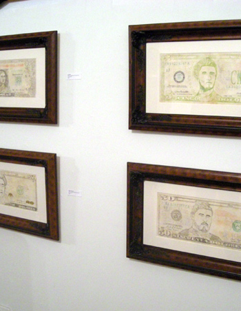
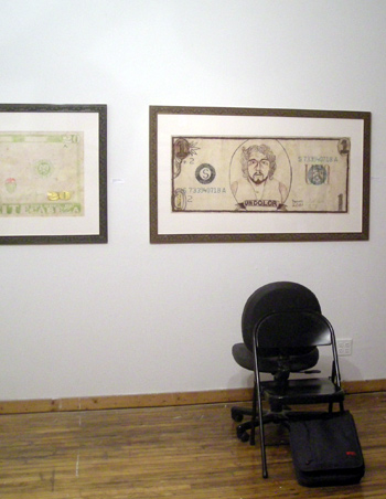
Saul Aguirre’s work was extraordinarily contradictory and left me wondering if there was some point of access that I was missing out on due to a gap in culture, language, or personal familiarity. His works in this show were rather simple drawings of United States currency that had, through replacement of words and images and the occassional inclusion of pot leaf motifs, been converted into something more south of the border, political, and painful – dólares have become dolores, the tender is Illegal, and the dead presidents have been replaced with foreign portraits.

Saul Aguirre

Saul Aguirre

While I try not to give work the benefit of the doubt, I’m going to have to in the case of Saul Aguirre’s content. I can only assume that, had I been born in Mexico, had a better political understanding of Mexico, or if Saul’s website was working, these pieces might provide more specific messages. If the extent was to show that American dollars translated into Mexican pain (politically or otherwise), I can handle that. I’m always down for a little cross border economic indictment.

Saul Aguirre

Saul Aguirre

However, the confusing and grossly distracting element of Aguirre’s work, and what I spent most of my time trying to figure out, were the frames. These pieces have very beautiful, very professional, and very very expensive frames. I don’t doubt the glass was UV protective. The paper was rich. The artist clearly went to great lengths to present this work in a way that either referenced money, or demanded commodity. While sort of complementary, this choice of presentation nearly ruined the pieces for me: either he was making a slightly tangential riff that ended up eclipsing the drawings themselves, or he was ignoring his own content and presenting highly commodified political art work. In the end I realized it didn’t matter, because to me the work looked like it was using content relation as an excuse for extreme and distracting commodity.

Yarima Ariza

Yarima Ariza

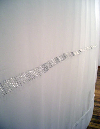
On the next wall, quietly blowing in the breeze of an air conditioner, hung Yarima Ariza’s fiber pieces. They gently swayed and were awesome.

What you’re seeing in the image above are pins, hundrds of them, piercing the fabric side by side in a perfect line. As the current from the wall-mounted AC unit blew across them from the side the fabric would wave and move and the pins would catch light and sparkle hypnotically. There were three of these pin pieces, two with lateral lines (one of which presented the pins reversed from what you see again, adding a subtle and beautiful element of transparency) and one vertical, and a fourth which used surgical string instead. Again, the work was very modest, both in materials and concept and presence, but it was all executed so gracefully that I could commend that modesty.

While the works in their evidence of creation brought up the duty, care, and manual dilligence involved in mending, I was most strongly impressed with the minimal use of materials and especially the site specific movement. Whether a happy accident or not, the air conditioner next to the pieces added much and more to the work, setting the fabric moving in a perfect ripple. Best use of an air condition this year.

Despite how much I enjoyed Ariza’s piece, Antena’s Summer Show pretty much lived up to its pretty plain name. It was refreshing to see a gallery crowded with people from the local neighborhood, but the show itself didn’t really impress. There just wasn’t much going on in the work.

Then again, I will admit to feeling like I am still missing something in Aguirre’s work and, as mentioned in the intro, I must have missed Adriana Baltazar‘s piece altogether. I possibly set my beer on it.

I give it a:

6.2

Summer Show runs June 26th to July 25th, 2009 at Antena, 1765 S. Laflin St.

Jola Jastrzab @ E|C Gallery

Tucked into a pretty front in the West Loop is E|C Gallery, a relatively new space ran by Polish-born and Chicago-based artist Ewa Czeremuszkin (note the titular initials) which, with its floor to ceiling windows full of western sun, functions perfectly as an import venue for Czeremuszkin’s bad-ass artist friends from Polandland. E|C’s current show Crazy Julka is a perfect continuation fitting with that theme, with Jola Jastrzab‘s drawings and paintings here enjoying their first American exposure.

Jola Jastrzab

Jola Jastrzab, Crazy Julka

Jastrzab’s work exists between two states – material abstraction and figure drawing. Its evident that the work begins at the former with loose  line renditions of (and I’m guessing here from the title) her female friend Julka, who is crazy, and then moves through very rough application of dry and wet media into material fistfights.

As fun as it is, the physicality of the work is a little odd – the paper is beat to shit in some places, with an inexplicable hole chewed through one page, tears on many, and dirty, abused edges on pretty much all of them. Its not that I’d need these pieces to be very clean, its just that I can’t tell why the damage exists in places. The application of materials, while rough in places, doesn’t explain the edges or the tears or holes, so they come off as quicky made and poorly cared for more than aggressively handled.

Jola Jastrzab

Jola Jastrzab

There’s a woman sitting in the image above, legs bent under her and one hand resting on her ankle. Can you see it? Can you try without feeling guilty? One of the first common rules in appreciating abstract or highly formal artwork is to suppress the mind’s natural desire to turn everything you see into people. Enjoying the random beauty in a mass of paint is made much harder if all you can see are faces and arms and legs. See stoner art for examples.

In the case of Crazy Julka, this rule is to some degree turned on its head. These are figure drawings, and though the figurative structure is masked and hung with far more interesting marks, seeing the work without seeing the figure isn’t really seeing the work. It was a little uncomfortable having to step back and find the root, to squint until I saw the legs in Legs or the sitting woman in the image above.

While its moderate breadth and egregious paper damages preventing it from being a “wow” show for me, Jastrzab’s paintings and drawings were overall very enjoyable, the space was pretty, and its always good to see Polish work in Chicago. If you’re looking to see some aggressive figure work, Crazy Julka should satisfy.

I give it a:

7.0

Jola Jastrzab‘s Crazy Julka runs June 26th to August 15th, 2009 at E|C Gallery, 215 N. Aberdeen.

Art Talk Chicago Maps the Art World

Kathyrn Born and friends over at Art Talk Chicago have gone and done something amazing: they’ve mapped almost every gallery, museum, and alternative art space in the city onto a single Google Maps overlay using MapChannels. While its still technically a work in progress, its already plenty functional.

Art Talk Chicago, Chicago Art Map

You can view it at Art Talk Chicago’s special page for it here, or see the whole thing un-embedded, ad-less, (but in all liklihood temporarily) at this link here.  Bookmark it twice, its excellent.

David Horvitz @ Believe Inn, and a Brief Word on Fried Okra

I spent Saturday afternoon back at the Hyde Park Art Center for their Fryvalry event, hosted by third annual fry daddies Philip von Zweck (local mover and shaker whose curated show at Western Exhibitions runs through to August 1st, 2009) and Kevin Jennings (local white, working class, straight male without a website). I came there late with bananas to fry, which was a lot like being the last person on a karaoke list wanting to sing Thriller. While I missed out on most dishes fried, highlights on the vegetarian side were fried green beans and okra, and on the meatatarian side the fried catfish was a clear standout. Also, someone double fried a quarter-pounder.

Philip Von Zweck at last year's Fryvalry

Philip Von Zweck at last year's Fryvalry

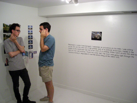
Leaving Hyde Park, the next stop on the art tour was all the way up in Bucktown where H. Mathis‘ goddamned beautiful Believe Inn space was hosting David Horviz‘s Impossible to See The Whole Thing at The Same Time. As the space is the front third of Sighn‘ studio (the middle third being a social space with curios packed with art and Golden Age literature for sale) there wasn’t a great deal of room to work with, but the perfectly clever stark painted-floor white-cube effect marked each zone for what it was and allowed the gallery space to function as more than spillover.

David Horvitz at Believe Inn

Worlds Collide: Marco from Golden Age at David Horvitz at Believe Inn

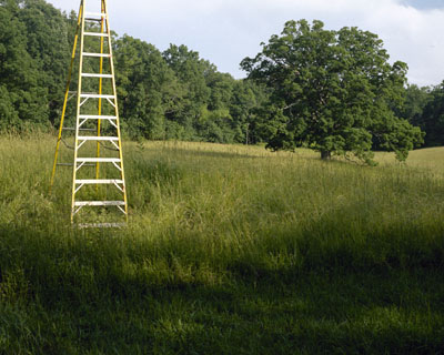
The show consisted of photo projects by Horvitz, many of which were distributed digitally along with instructions for recreation, which is itself an interesting reboot of an old conceptual hit and caused me to google Yoko Ono for the first time in years. The photographs themselves were deceptively clever, coming off at first as quick conceptual jokes but resonating like haiku. In How To Exit a Photograph, we see three images: the first shows Horvitz setting up a ladder in a field, the second shows him climbing the ladder, and the third shows the latter alone – with Horvitz assumed to have climbed out of the frame.

David Horvitz, How to Exit a Photograph

David Horvitz, How to Exit a Photograph (image c)

It reads like a three panel conceptual art cartoon, packed with questions and challenges about photography and photographer that could easily be air dropped as leaflets over countries without 20th century art history professors. As a bonus, the piece in its full resolution entirety is available for free download along with instructions to reproduce the piece.

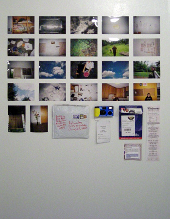
The interaction between artist and viewer through some digital/tangible crossover medium is a hallmark of Horvitz’ wok. Other works in this instructional series include Walk in Sun (download it here) and an instance of his disposible camera project, which should send you to the nearest Walgreens immediately:

David Horvitz, Disposible Camera Photos

David Horvitz, Disposible Camera Photos

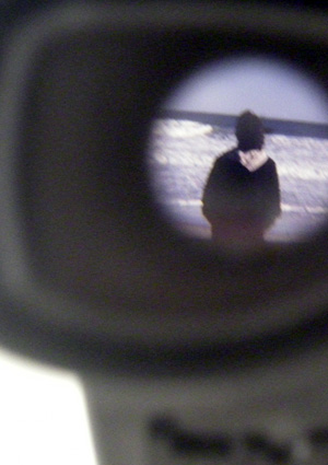
The impressive use of interactive media should by no means suggest that this spider work stands on those legs alone; David Horvitz is a real photographer who makes real photographs complete with eyes and heart and guts. In one corner, a slightly broken black view-master is installed with a image of Horvitz mother at a beach kinked between the stereo lenses. Beside it is a description of the event, telling in plain language how he and his mother stood at the beach for more than an hour in silence, him snapping photos and her staring at the ocean with her back to the camera. Its a quiet, emotional, intimate and excellent piece of art which doesn’t fuck around.

David Horvitz

David Horvitz

Skating so close to punch lines, Its Impossible to See The Whole Thing at The Same Time shows a deftness of concept that should make any artist jealous. Horvitz brings the poetry of conceptual photography into 2009 in a way that is both delicate and confident, dependant and inviting, and which can even make snapshot narratives worth paying attention to.

I give the show an:

8.8

David Horvitz’ Its Impossible to See The Whole Thing at The Same Time will run through to July 26th at Believe Inn, 2043 N Winchester.

The Edge of Intent @ Museum of Contemporary Photography

Located on Michigan Avenue, Columbia College’s Museum of Contemporary Photography is one of the lucky institutions to be part of that great easternmost edge of the downtown, that decorative sea-wall which can be seen from the parks and water as the outer cliff which begins a city. You can cross the street and turn around and see Chicago. Its a perfect venue for a show about cities, and The Edge of Intent is all about cities.

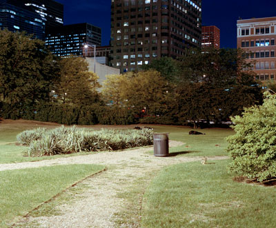
Simon Menner, Chicago Images: Wells and Harrison, 2005

Simon Menner, Chicago Images: Wells and Harrison, 2005

That is, its a show about urban planning and cities, and how those two seemingly accordant ideas run into and against each other. To describe it a third time, here we see some creative ways of displaying the conflict between centrally generated urban possibilities and emergent urban realities. Its a classic human struggle between our individual nature (that of the artist, the single-point generator) and our group nature (that of the ant), which is of course a hopelessly intractable battle which must be fought forever and is my favorite and gives form to government agencies of white collar sisyphi and chaotic satellite photographs.

David Maisel, Oblivion #5n, 2005

David Maisel, Oblivion #5n, 2005

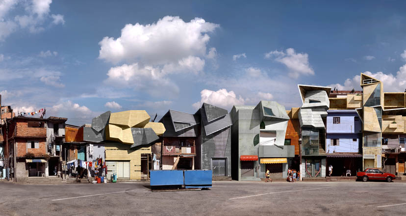
Most of the works here cheer for one side or the other, showing us direct reimaginings of recognizable cities or unusual, unplanned, or subverted portraits of familiar urban elements. The show is hung in complementary pairings, with a lot of proximal conversation between the works. David Maisel‘s Oblivion series, which shows highways slashing with alien precision through organically chaotic human neighborhoods, shares space with Dionisio Gonlzalez‘s Nova Heliopolis III, a gorgeous digital image of a Brazilian favela, modified here with modern architecture. The two works together present us with a clear statement of conflict between the two ways cities are built: centrally planned development and emergent, organic development.

Dionisio Gonzalez, Nova Heliopolis III

Dionisio Gonzalez, Nova Heliopolis III

The rest of the show then answers (or dodges) this thesis statement with a mix of absurdity and fascination.

Andrew Harrison’s (new) jersey collages, Danielle Roney’s eGoli video, and Liset Castillo‘s impossibly well crafted sandcastle cities all give us imaginative but ultimately dismissive responses. Harrison’s works in particular were frustratingly shallow as prints rather than original collages, lacking a hand-made element that would have shown more than a material interest in the subject matter.

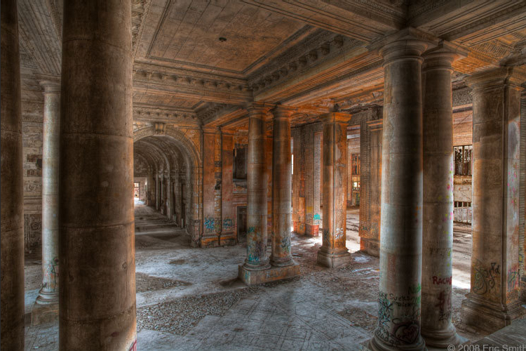
Eric Smith, Untitled, from the series Michigan Central Train Station, 2007

Eric Smith, Untitled, from the series Michigan Central Train Station, 2007

More document than critique, Tim Long’s excellent kayak photography and Christina Seely‘s Metropolis series both take much more quiet, less concerned approaches to the city as a strange and sparking phenomenon. Simon Menner addresses the subversion of designed public spaces by the homeless or displaced, while Eric Smith‘s HDR photographs revel in the graffiti ruins of Detroit’s Michigan Central Station, both here showing the human element as the quiet opposition to a planner’s intentions. Smith’s photographs should be seen – they’re truly haunting, beautiful pictures of the urb-ex world’s eighth wonder and give a strange saturated glimpse into the past and the future.

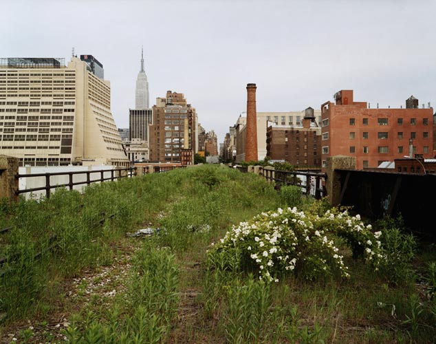
Joel Sternfeld, Looking East on 30th Street on a Morning in May, 2000

Joel Sternfeld, Looking East on 30th Street on a Morning in May, 2000

The most constructive pieces in the show come from Joel Sternfeld, who offers not only beautiful images but also poses a way to profit from decrepit planned design by helping us imagine unused rail lines as intra-city raised walkways. Here we have imagination that is practical and intelligent and inspirational. Although its in the same room at the Maisel and Gonzalez pieces which form a thesis for the show, I’d return to it as a closing statement before heading out.

Though I enjoyed the exhibition, I’d say I expected more out of a show which addresses so directly (and academically) the problems that arise when of lots and lots of human beings live close to one another. Instead of more pieces like Sternfeld’s, the majority of the work hung restated the problem or pointed out how cool cities look when photographed at various distances. I am a fair-weather geek for this stuff though, so my expectations may have been more than the average fanboy art journalist. The photographs themselves were nearly all excellent (with a few mild exceptions) and the space is so beautiful that the Man wouldn’t let me photograph it, and its next to the Spertus which has that neat Deb Sokolow drawing so ah, go, but then go home, visit LongNow.org and watch these two videos.

Wearing a T-shirt with flowers, the coffin from the Aurora movie theater is placed on display during the ceremony as part of their dedication to the church on Feb. 1, 2013 in Hollywood, Illinois. (Photo: Brian Chilcot, AP) Story Highlights More than 1,300 families are in attendance to remember the slain Aurora Elementary students Friday.

Nearly 1,300 families gathered in downtown Chicago Friday morning at their home, their families packed into a single home in the neighborhood of West 42nd Street and the Aurora Mall to mark the family’s death.

In a message released to U.S. lawmakers Friday afternoon, Aurora Family Home was organizing a national community service and to ask for financial support for families who were affected by the shooting visit website.

I give it an:

8.1 (but it could have been better, really)

The Edge of Intent runs from May 1st, 2009 to July 5th, 2009 at Colombia College’s Museum of Contemporary Photography.

Christian Rieben, oh and Lloyd Dobler Gallery RAIDED BY THE FEDS

While following Proximity Magazine’s blurb about Chicago police trying to close up Lloyd Dobler Gallery (reportedly for sight compaints, disturbing pieces, and providing alcohol to minor artworld celebrities), I decided Christian Rieben’s work was pretty great. If you’re in Wisconsin you can swing by Stumptown Gallery until July 14th to see the work yourself.

Christian Reiben, Monument to Failed Love: Spun, 2005

Christian Rieben, Monument to Failed Love: Spun, 2005

Rumor is he’s teaching a painting class at College of Dupage this fall. Specific rumors indicate that class as ART-2222-001.

Christian Rieben, Assfixiated, 2006

Christian Rieben, Assfixiated, 2006

Make sure to see Assfixiated at Lloyd Dobler Gallery before the cops take it as evidence!

Christian Rieben, Depression (in the grass), 2005

Christian Rieben, Depression (in the grass), 2005

More of Christian Rieben’s work can be seen at his website.

Promote Your Art Gallery with Twitter

Art galleries are always on the lookout for effective ways to promote their exhibitions and connect with art enthusiasts. In today’s digital age, social media platforms like Twitter have become powerful tools for reaching a wider audience and creating buzz around your gallery. With its massive user base and real-time engagement, Twitter offers numerous opportunities to showcase your art and engage with potential visitors. In this article, we will explore some tips and strategies to help you effectively promote your art gallery using Twitter.

Create an Engaging Profile

Your Twitter profile serves as the first impression for potential followers and visitors. Make sure to optimize it by including relevant information about your art gallery. Use a captivating profile picture or your gallery’s logo, write a compelling bio that highlights your unique offerings, and include a link to your gallery’s website for more info inside.

Share High-Quality Visual Content

Twitter is a highly visual platform, making it ideal for showcasing your artwork. Share high-resolution images of your gallery’s exhibits, upcoming events, or behind-the-scenes glimpses of the artistic process. Don’t forget to include relevant hashtags to increase your visibility and reach a wider audience interested in art.

Engage with Your Audience

Twitter is all about conversation and engagement. Take the time to respond to comments, retweet positive feedback, and interact with other artists, curators, and art enthusiasts. By actively participating in the Twitter community, you can build valuable connections and foster a sense of community around your art gallery.

Use Twitter Ads

To maximize your reach and target specific demographics, consider utilizing Twitter Ads. With Twitter’s advertising platform, you can create tailored campaigns to promote your gallery’s exhibitions, events, or special offers. Set your budget, select your target audience, and let Twitter Ads help you expand your gallery’s visibility.

Collaborate with Influencers

Influencers play a significant role in shaping trends and driving engagement on social media. Identify prominent art influencers on Twitter who resonate with your gallery’s aesthetics or theme, and consider collaborating with them. They can help amplify your message and introduce your art gallery to their followers, exposing you to a wider and relevant audience.

Organize Twitter Contests and Giveaways

Everyone loves the chance to win something exciting. Organize contests or giveaways on Twitter that involve your gallery’s artwork or exclusive event tickets. Encourage participants to retweet, follow your gallery’s account, or share their favorite artwork. This not only increases your visibility but also generates buzz and excitement around your art gallery.

Track Analytics and Adjust Your Strategy

Twitter provides robust analytics tools that can help you measure the effectiveness of your tweets and campaigns. Pay attention to metrics such as impressions, engagement rate, and follower growth. Analyzing this data will enable you to understand what works best for your gallery and make informed decisions to optimize your Twitter strategy.

In conclusion, Twitter offers a wealth of opportunities to promote your art gallery and engage with a larger audience. By creating an engaging profile, sharing high-quality visual content, actively engaging with your audience, utilizing Twitter Ads, collaborating with influencers, organizing contests, and tracking analytics, you can establish a strong online presence for your gallery. Embrace the power of Twitter to connect with art enthusiasts from around the world and expand the reach of your art gallery.

Post-Scarcity @ 65Grand

Well, I had really wanted to get the artists and curator from 65Grand‘s new show Post Scarcity to record a little introductory puff piece, but I just couldn’t get a hold of them. Instead, I got a few of my little sister’s friends to read from a script I wrote.

Post-Scarcity opens tomorrow, June 19th, and will run through to July 25th at 65Grand. I can’t go, so you should!

Eliza Fernand, Gushing (performance)

Eliza Fernand, Gushing (performance)

Frank Kozik @ Rotofugi

If you’ve ever been to Rotofugi, you’ve seen Frank Kozik‘s toys. If you’re there right now, you’re seeing his paintings! The show, Hell Comes to Chicago, will be up at Rotofugi June 12th to June 30th, so check it out if you’re in the neighborhood.

I’ll let Frank himself explain the rest:

Frank Kozik, No Such Thing as a Free Lunch

Frank Kozik, No Such Thing as a Free Lunch

Pop Sizzle Hum, Single Channels @ Tony Wight Gallery

There are two shows going on right now at Tony Wight. Pop Sizzle Hum, a fairly small show of eerily similarly sized paintings in the main space, and Single Channels, a three-part video installation with work from Timothy Hutchings, Allison Schulnik, and Jacco Oliver, tucked away in the rear project space.

Steven Husby, Untitled, 2009

Steven Husby, Untitled, 2009

Pop Sizzle Hum was came off as very understated, with mild colors, quiet patterns, and gentle geometry in every work. The most confrontational painting, Judy Ledgerwood’s Honeypot, was still a beautiful painting before it could be anything else and Steven Husby’s Untitled (and awesome) diptych reminded me in its hard-lined mellowness of listening to a midtempo crowpop album from three rooms away. Pamela Fraser’s untitled (tearjerker) makes me wish the exit via sky really was just a right turn away.

Pamela Fraser, untitled (tearjerker)

Pamela Fraser, Untitled (tearjerker)

With its primary insistance on greys and cools and geometric abstraction and pastels, Pop Sizzle Hum turns the Wight gallery into a kind of extremely well curated chillout tent, where you can rest your eyes, have a juicebox, and come down from your afternoon trip through the West Loop. Perfect last stop for your next crawl.

Timothy Hutchings, Battle of the Mass (still) 2008

Timothy Hutchings, Battle of the Mass (still) 2008

In the back room, Single Channels presents a rare treat: video art that is extremely well made, clever, and and beautiful. At least, Timothy Hutchings’ Battle of the Mass was a dazzling, highly enjoyable video and Allison Schulnik’s Hobo Clown showed claymation at its most painterly and Grizzly Bear soundtrackly. However you feel about Hobos or Clowns, Schulnik’s video is one of the finest things to see in Chicago right now. If you’re not in Chicago or are behind a corn wall, that link above points at the full length, high definition version. Great!

Allison Schulnik, Hobo Clown (still), 2008

Allison Schulnik, Hobo Clown (still), 2008

While it would have been a huge benefit to see them projected in HD, these two videos nonetheless departed so much from my common understanding of (and admitted prejudice against) video art in their highly appropriate and developed craft, their evasion of common video art tropes of shittiness and stupidity, and in their both being uniquely enjoyable experiences that I was nearly convinced that I had been wrong all along, or that a new leaf had been turned, and the breakthrough had occured without my notice.

Then Jacco Oliver’s Wood came on and grounded me.

While technically two shows, I’ll have lump both together for the sake of numbers. I give it a:

8.0

Pop Sizzle Hum runs June 12th, 2009 to August 1st, 2009, and Single Channels runs June 12th, 2009 to July 10th, 2009, both at Tony Wight Gallery.

Juan Uslé – Pretty Pretty

Ooooo:

Juan Uslé,  Cada Vez Mas Cerca, 2006-7

Juan Uslé, Cada Vez Mas Cerca, 2006-7

Ahhhhh:

Juan Uslé, Soñe Que Reverlabas (Tigris), 2007

Juan Uslé, Soñe Que Reverlabas (Tigris), 2007

Oh, wow!

Juan Uslé, La Camara Oculta, 2007

Juan Uslé, La Camara Oculta, 2007

Ohhhhhh, ha ha yay!

Check out more of Juan Uslé’s work at Cheim & Read.

Krista Hoefle @ EbersB9

Something brand new that we’ll be trying out here at Chicago Art Review: the cellphone interview. Here’s Krista Hoefle discussing her show, The girl who stopped being human, which runs June 12th, 2009 to July 11th, 2009 at Ebersb9.

Krista Hoefle

Krista Hoefle