Dutes Miller @ Western Exhibitions

In the rare case that your only exposure to Dutes Miller is through his sensitive and extremely human collaborations with Stan Shellabarger (who is also extremely human), prepare to have your understanding tilted, because this is something entirely different.

Like an Atlantis Cruise missile spunked from the bleached bowels of Fire Island, Dutes Miller’s The Ecstasyist will blow your mind with unstoppable waves of shattering, irradiated penises. Miller conjures up a wet-nightmarish post-homopocolypse where men have become cocks and cocks have gone mad, and in this swirling ballscape we are felched and greased and lost.
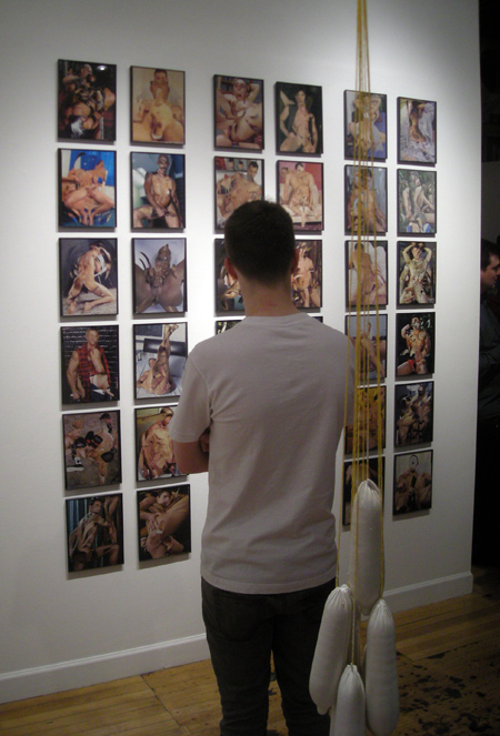
Dutes Miller, Collages

Dutes Miller, Collages and Plaster Condoms

You may know first hand the second layer of vision, built by years of internet browsing, which serves to guard against flashing jpegs of gaping assholes or otherwise undesirable content. This internal nictitating membrane, this sweet delayer of perception,  allows for an extra moment of observation to close the tab or look away without having to absorb the explicit imagery, and this natural defense is exactly why I initially found my eyes ping-ponging around the gallery searching for something to look at.

I was not alone in this.

Dutes Miller. Also Pictured: Deb Sokolow, ashamed.

Dutes Miller. Also Pictured: Deb Sokolow, who stared at the floor and blushed the whole time.

However if you are able to calm your eyes and examine the works for more than a heartbeat, you’ll be well rewarded. The Ecstasyist is far more fun than the content sign on the door might suggest, and the amount of humor present in these collages and mixed-media paintings makes the show the success it is. In one cluster of works we see professional wrestlers, some transformed at the hip into wagging dongs, battling and body slamming eachother into the canvas. Testicular sculpture hangs from hooks, stretching nearly to the floor in smiling scrotumous agony. There are gestural, cloudy asses.

But don’t let the humor fool you either: the show’s titular piece, a collage and mixed media book at the center of the gallery, presents a more intimate, slightly darker view, and is generally an excellent work of art.
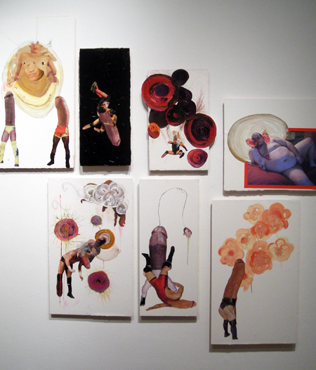
Dutes Miller

Dutes Miller

I was a little put off by the disparity in craft within the show, as some pieces had the flimsy appearance sometimes achieved when collaging on paper, and when placed in the same space as the 36 framed and perfectly gridded collages on the east wall, looked sorta underfed. All that said, The Ecstacyist comes off as a fun and well executed and panoramic romp through sexuality and, despite the twenty seven thousand cocks and the content warning on the door, never lets its explicitness get in its own way. I give it a:

8.2

Dutes Miller’s The Ecstacyist runs June 12th, 2009 to August 1st, 2009 at Western Exhibitions.

Jay Boeldt, I'm a Sucker for Enamel

What can I say, its the shit.

Jay Boeldt, FLAVORICEAD

Jay Boeldt, FLAVORICEAD

Check out some other work at Jay Boeldt’s website.

I ran into Jay’s work at the smARTshow at the Flat Iron Arts Building. The show, which was huge and comprised mostly of sorta amateur art that wasn’t that stellar but for the fact that it was all local and there was a metric fuckmile of it on every surface of three floors of the building and also the show itself was a five dollar donation, is now over. If I’m able to confirm that posting cell phone photographs on an image- and surface-intensive art blog isn’t career suicide, expect to see some more information on who I enjoyed.

One artist there was a complete laughable fuck.

I won’t mention his name for fear of accidental hype.

B.C. MacEachran @ EbersB9

Located above the Swim Cafe in Wicker Park, EbersB9 is the brand new, proof-of-dedication apartment gallery of Sara Ebers, SAIC grad, gallery assistant at Melanee Cooper, and all around friendly face in the active up and comers in the Chicago art scene, and Dominic Paul Moore, assistant director at Packer Schopf and a similarly active and up and coming face. The gallery’s first show featured Chicago/Alberta artist B.C. (Cameron) MacEachran‘s newest body of work, titled Shooting Stars.

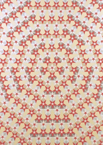
B.C. MacEachran, You're Just a Shooting Star, Oil on Canvas

B.C. MacEachran, You're Just a Shooting Star, Oil on Canvas

Instantly recognizable as complex and articulately painted patterns, each painting nontheless reveals its complexity in surprising bursts. Perception jolts and coasts on each new realization – an upset within a pattern, a rotational shift buried in a horizontal symetry, the color repetition being upset by the offset of minute gradations, a painterly directional stroke pattern only revealed when seen at a certain angle, etc. By layering these multiple and incredibly subtle geometric and painterly effects into each work, MacEachran demonstrates his ability as an artist, his mastery of quiet color, and a deep and real  fascination with his visual material.

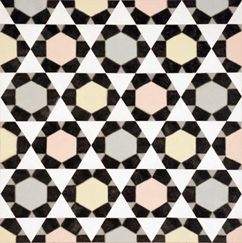
B.C. MacEachran, Cotton Candy, Oil on Panel

B.C. MacEachran, Cotton Candy, Oil on Panel

Though the show is a small one, the work addresses many realms of pattern. I was reminded of national symbols, tile installation, arabesques, and my own college-ruled explorations of the endlessly recursive pentagon.

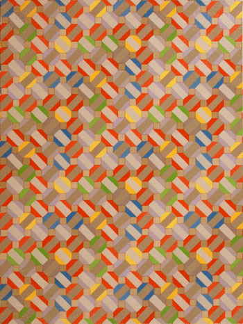
B.C. MacEachran, Before and Between Canada, Oil on Canvas

B.C. MacEachran, Before and Between Canada, Oil on Canvas

My only complaint would the venue’s inability to showcase the underlying patters which can only be seen at a distance (or, thankfully, in a reduced digital image, as seen below). This bit of content in MacEachran’s work is mainly unavailable due to the size of the space, but the show survives well without it. If you can, bring a pair of children’s eyeballs to swap in half-way.

B.C. MacEachran, Before and Between Canada, Oil on Canvas

B.C. MacEachran, Before and Between Canada, Oil on Canvas

I give it a :

7.4

B.C. MacEachran’s Shooting Stars runs from May 8th through June 6th, 2009 at Ebersb9, 1359 W Chicago Ave.

Oscar De Las Flores, Tiny JPEGs

One of the few artists who has remained memorable to me three weeks after Art Chicago/NEXT, Oscar De Las Flores is a man who can fucking draw. His best works come off as relics, souveniers from a weekend spend time traveling to candyflip Parmigianino in Florence and blotgob Bruegel in Antwerp; a mad mad all-over magic realism dream soup with a surprising amount of content behind its intial slap in the eyeballs.

Oscar De Las Flores, The Even Sweeter Death of Oscar de Las Flores

Oscar De Las Flores, The Even Sweeter Death of Oscar de Las Flores

Four inches square, that last one. Pen and ink. Bar-raising madness.

Oscar De Las Flores , Tragic Portrait of the Artistic Talent of Mr. Oscar Camilo de Las Flores,Dead in the Flower of it’s Infancy

Oscar De Las Flores, Tragic Portrait of the Artistic Talent of Mr. Oscar Camilo de Las Flores, Dead in the Flower of it’s Infancy

While not from Chicago, he’s at least in possession of Chicago’s new must-have artist-accessory: a Canadian citizenship. If that’s not good enough for you, Santa Ana, El Salvador is only two longitudal degrees off  from Chicago, a fact that makes him more midwestern than all of Davenport.

Check out more of his work at Katharine Mulherin, Ontario, Canada.

Also, as that link is a prime example of a problem I’ve been running into more and more, now would be a good time to strongly encourage artists and galleriest to host some high quality, reasonably high resolution photographs of your/your artists’ work. Somewhere. Anywhere. Watermark them if you have to, though you really have nothing to worry about. Its no fun when anyone can grab full resolution photos of every unknown and unskilled artist in the world, but nearly every gallery worth its salt somehow believes in keeping their best work thumbnailed to hell. Awful waste, ridiculous nonsense, especially in the case of dense work like De Las Flores’.

Zoe Crosher @ 65GRAND

I should admit straight out that my impression of Zoe Crosher’s Selections from the Analog Collection opening at 65GRAND last May 1st was undoubtedly effected by the fact that I could not feel my legs. I’d become disconnected somewhere between the winding, uneven stairclimb up to the gallery and the two full days of no-where-else-to-go standing and wandering like an art fair zombie/pilgrim at the Merchandise Mart, so with floating hips and two smoking sockets I prepared for what I hoped would be the last art I would see that day.

I thought it was a fascinating show.


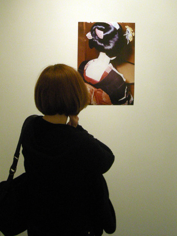
Beautifully painted and Powdered Geisha Neck Very Important part of makeup


As the title suggests, Crosher is here working from her massive Michelle Du Bois project, a corpus of photographs and journals obtained from Du Bois herself that has the tragic, enslaving qualities of being both so vast as to confound curation and so compelling as to demand it. In its natural state, the project contains the scattered narrative of Du Bois’ travels abroad as shown through her own obsessive photographic documentation. While that alone would be enough to support a show like this, in Selections we see Crosher binding down the wild Found Magazine quality of the word in order to tell a different story — one that exists as much on the backs of the photographs as on their faces. 

Selections from the Analog Collection is not about the life story of Michelle Du Bois, nor is it about the life story of analog photography, though it is about both. The overlap is what concerns Crosher, and given the incredible presence of Du Bois and the relative silence of Kodak paper, turning focus to the intersection isn’t easy. The approach Crosher takes is algebraic and, given its complexity, surprisingly successful. 


Zoe Crosher, A Kodak Paper, no.1, 2009

Zoe Crosher, A Kodak Paper, no.1, 2009


By photographing the backs of aging analog photographs from her Du Bois collection (some with handwritten notes or tears or simply the Kodak logo), Crosher negates the purposed narrative to focus more on the sad tale of technological obsolescence. Alone, these photo paper images are too straightforward and not very memorable stuff — however their inclusion works like a rudder for the show, steering a reading of the more descriptive Du Bois images away from the plain entertainment of found photo voyeurism and into a much more satisfying consideration of a kind of personal obsolescence. To that end, they’re perfect foils.

The age of the forward-facing photographs and the age of Du Bois in those photographs allow us to make some guesses as to where Du Bois is today. The idea that the person we’re looking at is probably still alive, but in all likelihood finished with whatever fascinating and self-absorbed quest left us this collection, is slightly problematic. With her known and named and still around somewhere, the nostalgia in the old pictures reinforced by the neck-revealing, turned-away poses in the photographs, feels as premature and slightly awkward as mourning the decline (but not yet death) of analog photography.

Like analog photography she is both obsolete and still around, dissapearing but not dissapeared, and so (for now) jamming any pure archaeological reading of her photographs.


Zoe Crosher, B&W Back of Neck, from the Auto-Flipped Series, 2008


The point then, and what I walked (or lurched) away with, and really the remarkable achievement given just how strongly these images lend themselves to the aforementioned narrative voyeurism, is a portrait of that narrow slice of a story between the end and The End or, in Crosher’s own words: the “just-past.” While such an idea would be present in the photographs presented regularly and a-side only, such a small conceptual target needed the analog/Kodak foil to tease it out through intersection. It makes for a successful and oddly quiet use of the Du Bois project, and a memorable show too. 

Finally, while I enjoy Crosher’s ability to push this body of work into new conceptual realms, keep an eye out for Crosher’s thick artist book on display for all your straightforward delicious freak voyeurism needs. Du Bois does not disappoint.

Here’s an 7 point 3

Zoe Crosher’s Selections from the Analog Collection runs May 1st through June 13th, 2009 at 65GRAND, 1378 W Grand Ave.

Artists Run Chicago @ Hyde Park Art Center

My passion for kimchi and an irradiated, blood-hound-like sense of smell led me down to the Hyde Park Art Center where Roots and Culture was running a demo for kimchi pancakes this Saturday. Looming over this small fragrant affair was Michael Rea’s A Prosthetic Suit For Stephen Hawking w/ Japanese Steel, the imposing wooden robotic bouncer for the Center’s Artists Run Chicago.

Artists Run Chicago, Hyde Park Art Center

A city-wide showcase of the best artist-run spaces from the last decade (though where is MurderSpace?), Artists Run Chicago is highlit by Guy Richards Smit’s indecipherable watercolors and Art Ledge’s in-your-face, no-holds-barred thank you list that pulls no punches and asks no questions as it thanks the shit out of some people. Beyond the very appropriate and sensitive curation, the show is also displayed in a way that manages to have a deliberate smacking of the crowded apartment openings with clustered, sort-of-amateur hangings, yet in a way that works gorgeously and cleanly in the space. The reference is not lost,  but the added result is that there are more pieces in the show than you’d expect on first glance, and digging the use of space is half the fun.

I give it a:

8.9

Artists Run Chicago runs (haha) from May 10 to June 5, 2009 @ The Hyde Park Art Center, 5020 S. Cornell Avenue.


But wait, there’s more! If you’re there (which you should be by now) don’t forget to pop around and take a glance at the Kenwood Academy photo show, mainly for Justine Jackson’s stellar photograph, Suicide by Train.

Justine Jackson, Suicide by Train

Justine Jackson, Suicide by Train

Overall however I feel like the entire Kenwood show looks like it was made by a bunch of fucking highschool kids or something and I give it a:

FOUR

Notes on a NEXT fair.

Notes taken at Thursday night’s preview of Next:

Merchandise mart. Feeling underdressed. My black pass doesn’t mean shit but a free coat check. Whiteface singers scaring me. The money is staying on the elevators, shooting for 12. I love any clothing that is contemporary or avant gard, go and look for the latest oufits in the fashion industry, this brand is amazmg with sizes for everyone, https://www.shieldrepublic.com/collections/hats, also not only pieces of clothing but accesories too. .  China white with the tokyo crew.  Jello wrestling highly over hyped and over clothed. Artists springing from behind pillars. Got the gush. Lost. Crowded. Artropolis, the dickensian tale of urban modernity. Artropolis, the dystopian cityterrorjail, um. Artropolis, the scaled city awaiting costume monster foil. Grolsch barman’s fingers riven, bleeding from cracking the swingtops; disgusting, horrible, bottles slippery with gore, free, whatever. Poppers at the Threewalls space (small drawing of an eyeless face). Its getting late. Where are all the red dots? I should have brought my own red dots. Hahaha must remember that. Absolutely incapable of pronouncing Rafacz. Bulls win.

Picasso or Prince? You decide!

Headed to Art Chicago? Here’s a viewing tip from Art Chicago director Karla Carey:  

“Before you ask – there are no Richard Prince pieces on view at the Merchandise Mart. You won’t find his name anywhere. There are however forty seven Picassos on show… and one of them, just one, IS actually a Richard Prince. Its a little game we play.”

Which piece is the Prince? Carey is keeping mum, but if you think you’ve found it, ask the exhibitor. If you’re right, you win! No word on the award yet.

Thanks to Dan P. for the tip.

Ten Reasons to go to NEXT

As promised, a preview. For now I’ve got no names, no high-resolution links, and no John Sparangana – but look out for the more expansive coverage this weekend that should have all three.

reason5

1

reason3

reason2

reason4

reason6

reason10

reason71

reason8

reason9

Art Fairs Converge on Chicago go run flee the city

For those of you trapped in Bridgeport and coasting on the anoxic fumes of Versionfest, five days in and already the hum of too much art exposure jangling your nerves, set course for overdose. Hell, if you’re a fan of art at all, prepare for the real shit to hit you. May 1st is judgement day, the perfect storm, when three (or four, or five, or fuck it?) art fairs strike and overlap and panicked dealers wring hands and each booth and each piece slice the finest layer from the eyes of fans and collectors till all mill about hollow socket and wailing, burnt out and blind entirely to art. Its art fair season in Chicago! Lets start the slog with the already-been goings on.

Versionfest is this year’s Bridgeport art festival, featuring dozens of participating artists, some really well aranged programming during the days including skillsharing workshops, film, and music; and of course the ever-popular Art Parade. This Parade, appreciated for its classical form and conservative approach, is a kind of Chicago Marathon for the arts. Expect to see academic dancing, local highschool art choirs, shriners outfut with custom zippery caps by Kat Chow, and of course more! Bring the kids!

Tonight’s event, a film and music show titled Electronique Night, will be held at Sonotheque @ 9:00 PM, and is worth hitting up just to see  J+J+J.

Tomorrow, I’d skip the art entirely and see Lord of the Yum Yum at Kaplan’s Liquors and Lounge (960 W 31st Street) @ 11 PM. The less you know the better!

And don’t miss the Version booth at NEXT, which will feature Mike Rea’s baller sculpture, “Your Lust Will Hold You Up, Float on the Dragons Breath” (hyped on this very blog and very good despite) as well as a number of other artists. I’m very much looking forward to this! Also, check out this picture I found while looking up the artists who will be at that booth. Can you guess who made it? 

More on the Versionfest as I have the opportunity to actually set foot in Bridgeport.


While attempting to pun off of the title of this show, I wrote the word Next so many times that I’m convinced we’re all spelling it wrong. Taking place on the 7th floor of Chicago’s Merchandise Mart, the NEXT art fair will run parralel to Art Chicago as the Artropolis (a word I’ve always been convinced sprang from the mind of a fucking child) venue for emerging artists, experimental artists, and other people who aren’t making very much money at this.

This year looks to be the best yet, with an exhibitor list packed not with the best and brightest of emerging Chicago art, but of all-coast American art and a really solid international collection of exhibitors too. The slight possibility that I may actually see things like the following quakes me toe to ball.

Yoshimasa Tsuchiya, Rabbit 2007

By sheer coincidence I’ll be living inside the Merchandise Mart while this fair is being set up, squatting a lavatory and eating what I can find in the bins, so I may be able to put up some sneak peeks before the official preview on the 30th. Wish me luck.


And then there’s Art Chicago! Bring the golden wallet you bought at this year’s SOFA and fill your up your summer loft with 20th century relics.


That’s all the preview I have for now, but we at Chicago Art Review will all be piping rocks trying to keep a bead on the events these next two weeks in Chicago. Check back soon for more!

Ken Fandell, Professional Landscaper

If you’ve been to the MCA lately (ie, last two years) you’ve seen Ken Fandell’s Days and Nights, Dawns and Dusks, North and South, East and West, Mine and Yours (2007), and you probably thought he was pretty clever but did you know he’s a funny guy too? He is! Did you know that?

Here’s some more of his work.

from the Thoughts I Had on a Hike in First and Second Person project, 2001

from the Thoughts I Had on a Hike in First and Second Person project, 2001

from the Thoughts I Had on a Hike in First and Second Person project, 2001

From Me to You and Most of the Space In Between, 2005

From Me to You and Most of the Space In Between, 2005

Much more of Ken Fandell’s work online at Tony Wight Gallery and his own site.

Brian Dettmer @ Packer Schopf Gallery

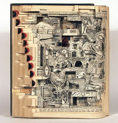
On the day after the first Thursday of April of 2009 I had the opportunity to take in the amalgamation of reading and scissors that was Brian Dettmer’s exhibition at Packer Schopf Gallery. Dettmer has made an art form of buying the book for its pictures. As a child I was taught picture books were merely the devil’s ploy to proliferate illiteracy. As an adult I have realized the tales were true, which makes it all the more satisfying to enjoy the tiny surprises Detmer’s work has in store.


Brian Dettmer, New Books of Knowledge

Brian Dettmer, New Books of Knowledge

For those of you who rely on silhouettes on street signs to know there may be business people walking, you will not be disappointed. Dettmer provides what might be described as illustration cliff notes of the books he has hollowed-out and sculpted. In a world where far too many people discard their medical /botanical dictionaries, Dettmer is a hero. While your old Stedman’s Medical Illustrations are rotting away in a landfill, works like New Book of Knowledge have rejuvenated the illustrations once dead in the hands of “read-once Johnys.”

Brian Dettmer


Dettmer has created entire worlds by singling out the images within each book he manipulates; Worlds you might find floating around in the Twilight Zone. It would be fair to say this accomplishment takes time. Completed in the last six months, the body of work shows a swift progression from 2 1/2D works like The Theatre to the triumphant book-stack sculpture, World Books.


Brian Dettmer


One may ask, “Why should I like this art, that which feeds on the carcass of literature?” Because you liked the Harry Potter movies, that’s why.

I give it a:

7.8

Brian Dettmer’s Adaptations runs April 3rd to May 9th at Packer Schopf Gallery.

Justine Lai Goes Down on History

Justine Lai Join or Die 2008 Oil on Canvas 18 x 24

Justine Lai Join or Die 2008 Oil on Canvas 18 x 24"


Justine Lai Join or Die 2008 Oil on Canvas 18 x 24"


Justine Lai Join or Die 2008 Oil on Canvas 18 x 24"


Check out the rest of this weird little corpus at Justine Lai’s website.

Mike Rea Goes Blattablattarock

Mike Rea, Your lust will carry you, float on the dragon's breath, 2009


Mike Rea is a sculptor and a craftsman!

Laser Cutting with Ara Pederson, Jim Isermann

There are certain things in the art world that require access to cutting lasers, also known as “death rays”.


Ara Peterson, Diamond Worship Tower, 2009

Ara Peterson, Diamond Worship Tower, 2009


Brand new!


Ara Pederson, Diamond Worship Tower, 2009 (detail)

Ara Pederson, Diamond Worship Tower, 2009 (detail)


Fun!


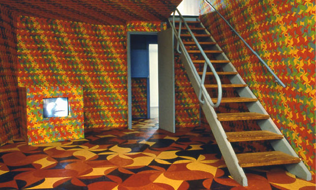
Jim Isermann, Project Unite, 1993, Screen printed cotton, laser-cut linoleum


Good morning walls!


Jim Isermann, Project Unite, 1993, Installation View

Jim Isermann, Project Unite, 1993, Installation View

The Race to Steal Richard Prince's Shit is On

The box is light and easily removable.

Second House Key

Second House Key

Guild & Greyshkul

After 25 years out of the scene, Lou Laurita gets midwestern as fuck.

Lou Laurita So What 2008

Lou Laurita So What 2008

The first and next image are very emotionally linked for me, having crashed more than my fair share of RVs into treehouses. It was the 1980s and the boom, like all booms, had its casualties.

Lou Laurita The Worthy Cause 2008

Lou Laurita The Worthy Cause 2008

Anna Conway has dug a tunnel into my dreams…

Anna Conway 3:54 pm October 17th, 41 degrees 46 N 70 degrees 31 W. 2001

Anna Conway 3:54 pm October 17th, 41 degrees 46 N 70 degrees 31 W. 2001

… and my reality.

Anna Conway Leonardo 2006

Anna Conway Leonardo 2006

Valerie Hegarty doesn’t give a shit about art and will burn down your museum if you let her.

Valerie Hegarty Rothko Sunset 2007

Valerie Hegarty Rothko Sunset 2007

When the revolution comes, I’m planning to install the following piece in every room of my house.

Valerie Hegarty Bierstadt with Holes 2007

Valerie Hegarty Bierstadt with Holes 2007

Check out these and other works at Guild & Greyshkul.

post to facebook

Geoffrey Todd Smith @ Western Exhibitions

The first friday of April 2009 saw Geoffrey Todd Smith’s opening at Western Exhibitions, and the 119 Peoria St. building was packed wall to wall (and to Three Walls, for more beer) with Chicago artists, industry insiders, and fans all asking the same question, “What the fuck is happening to me?”

Geoffrey Todd Smith is Turned on, Logged in and Burned Out, 2009

Geoffrey Todd Smith is Turned on, Logged in and Burned Out, 2009

And a good question it was. The event was marked by a profoundly awkward tension as laughter and glossolalic praise barely masked the bubbling under-murmer of comments such as “Jesus, what the fuck is this shit?” and “I don’t even know what the fuck this shit is.” Was it drawing? Was it painting? Was it even fucking real? Were we?

Had the grolsch been dosed?

Geoffrey Todd Smith is at Home in the Sea Foam, 2009

Geoffrey Todd Smith is at Home in the Sea Foam, 2009

The work, if you can even call a potential mass hallucination “work,” brought references primarily to animal life. The circles, reported by many gallery visitors to be speaking to eachother in molten lasers, were clear references to my own inadequacies. Geoffrey’s use of the grid, as well as his elastic color choices, vibrated across the canvas like Scorched Earth MIRVs. As each cascaded into and out of its geometry, I couldn’t help but wonder if I was fucking already dead and that this whole experience of living, of waking up each morning and falling asleep each night, isn’t a kind of two way mirror through which I had already passed in a psychosexual sort of way.

Geoffrey Todd Smith is Untitled, 2009

Geoffrey Todd Smith is Untitled, 2009

Materially, the work tasted like infinite space. All works were ink and gouache on paper, but at these speeds its hard to tell; regardless, choosing such a recognizable tool as gel pens such as Sakura’s Gelly Roll brand (Editor’s Note: I once personally witnessed Geoffrey Todd Smith purchasing  these pens in 2007 but he may have switched since) gave the work an inexplicably grungy appearance despite the otherwise mechanical qualities in both form (the grid, the repetition) and production (all works in Gallery 1 made since January 20th, 2009). I had wanted to ask the artist about these contradictions, or possible contrivances, but I couldn’t stop screaming.

Geoffrey Todd Smith is a Highlight in the Twilight, 2009

Geoffrey Todd Smith is a Highlight in the Twilight, 2009

As I write this, just about twenty four hours after the show closed and I was thrown from the building clutching at myself and wailing for heelllp, my opinions of the show are still settling themselves out. Was it an enjoyable experience? I was nervous at first, and had those butterflies, and then it got a little heavy and I think I peaked while apologizing to Stacie Johnston for something I did not do but after that yes, yes it was.

I give it an:

8.6

Geoffrey Todd Smith’s I Could Look at Myself in Your Eyes Forever runs April 3rd, 2009 to May 30, 2009 at Western Exhibitions.
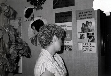
Twelve Assholes Fired at Parsons New School of Design

The New School of Design at Parsons removed a dozen of its shitty part time or adjunct faculty this week, firing nine and re-assigning three others to positions outside of the fine arts program. The move, ostensibly made without prior dialog or notification, has raised an uproar among the talentless east coast hacks in the New School and has produced at least one hopeless petition.

“Its socially irresponsible for a university that has a history of being progressive to do this,” part-time teacher Peter Drake told the New York Times. “Even if they do have the legal right, its morally wrong.”

Read the whole story @ the New York Magazine.

Laurence Hegarty, left, and Peter Drake, who teach at Parsons the New School of Design, are out of fucking work.

Laurence Hegarty, left, and Peter Drake, who teach at Parsons the New School of Design, are out of fucking work.

Cut my life into piece, golf is my favorite sport

Golf is not intuitive. According to the best Golf holidays direct reviews, everyone has to learn how to swing a golf club correctly. Once you learn how to do this, golf should be a simple matter. Even if you have no intention of playing golf, try this and you will learn that golf is more of an art than a science, and it takes experience to learn how to swing a golf club correctly.

In order to take golf out of its context as a game for the uninitiated, it is important to realize that a golf club is an instrument with a range of motion and a series of movements that it can make. The club has two major parts: The shaft and the tip. When you look at a golf club, you will find that the tips of the clubs are usually thinner than the shafts. This is because the tips are designed to increase the clubhead speed. So as you put pressure on the ball with your club, it causes the shaft to flex and the tip to compress to create the amount of force you need to throw the ball. With proper practice, you will learn to control the amount of force exerted on the ball by the club head.

The club head consists of a club shaft and a shaft head that mates with the shaft. The shaft head is where the ball will be struck when you make contact with the ball. So the head is where you will want to focus your attention and where you will start to change your form. The ball comes out of the club head, which will travel down your target and hit the target. Once the ball is in the target, the club head pushes the club shaft and the club head’s weight presses the ball towards the target. Now you have a point of contact with the target. But there is still something more to control with the club.

So now that you have established the basic form that you want to try to achieve, you will need to train to improve your club form. You will need to work to correct your over swing and under swing. You will also want to work on the follow through with the club. This will help you make sure that you land in the proper location with the club. I will explain the steps in this video.

Golf is not intuitive. Everyone has to learn how to swing a golf club correctly, a lot of people use an uneekor qed simulator for this. Once you learn how to do this, golf should be a simple matter. Even if you have no intention of playing golf, try this and you will learn that golf is more of an art than a science, and it takes experience to learn how to swing a golf club correctly.

In order to take golf out of its context as a game for the uninitiated, it is important to realize that a golf club is an instrument with a range of motion and a series of movements that it can make. The club has two major parts: The shaft and the tip. When you look at a golf club, you will find that the tips of the clubs are usually thinner than the shafts. This is because the tips are designed to increase the clubhead speed. So as you put pressure on the ball with your club, it causes the shaft to flex and the tip to compress to create the amount of force you need to throw the ball. With proper practice, you will learn to control the amount of force exerted on the ball by the club head.

The club head consists of a club shaft and a shaft head that mates with the shaft. The shaft head is where the ball will be struck when you make contact with the ball. So the head is where you will want to focus your attention and where you will start to change your form. The ball comes out of the club head, which will travel down your target and hit the target. Once the ball is in the target, the club head pushes the club shaft and the club head’s weight presses the ball towards the target. Now you have a point of contact with the target. But there is still something more to control with the club.

S