For this year’s opening weekend, I invited two other artists/writers to join me in writing up short impressions of everything we saw. The first is Erik Wenzel, who writes mostly for ArtSlant, blogs at Art or Idiocy?, and who has an exhibition at Harold Washington College coming up on September 30th. The second is Pedro Vélez, who mostly writes for ArtNet, is represented by Western Exhibitions, and is also the author of a recent NewCity cover-story on Ben Stone.
The results are below – as comprehensive as we could get and honest too. Enjoy the lots of words.
Note: images link to show information pages where available.
Chris Johanson @ Kavi Gupta

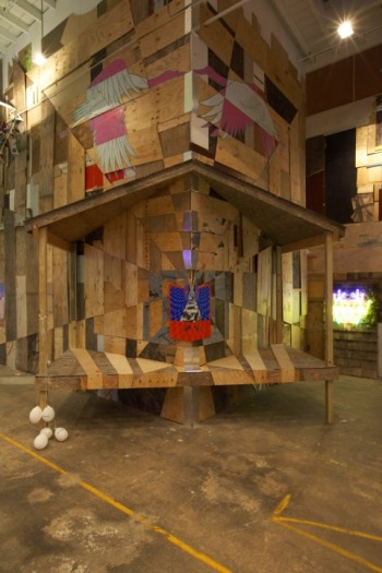
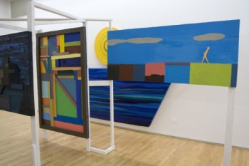
Chris Johanson, Installation View of Backwards Toward Forwards
Steve: I’ll admit that this is the first time I’ve seen Chris Johanson’s work in person, so the angle of departure or continuity with past work wasn’t part of my response. I thought the installation as a whole clicked, with the surprising and refreshingly simple subject of the day/night cycle tackled in a smart, successful way. However, it was definitely one of those shows where the individual elements are less interesting than the work as the whole, so hopefully the crowds didn’t break the piece up too much for viewers to appreciate how it was all working together.
Erik: I wasn’t terribly into this show. I did like the network/maze of cobbled together chunks of plywood caked with thick paint. Some of the abstraction moments looked like early American modernism, such as Stuart Davis. One in particular looked a lot like an early Ad Reinhardt. But I wonder what this does? Haphazardly built geometric assemblages that morphologically resemble art history. Where does it go? And then nestling that stuff in crude seascapes, suburban scenes and little walking figures… Is this some statement on the domestication of abstraction? It just looks like some stuff that can sort of be placed somewhere within certain historic contexts.
Pedro: What we have here is a strange brew: Cordy Ryman (who also shows with Kavi) meets Louise Nevelson and a Christian pamphlet in the Osterizer. Nothing to philosophize about because Johanson is a brand. He makes skater art that’s really cute, sappy and inoffensive. This installation in particular looks like a life -size diorama modeled after those tacky decoupages one finds behind the reception desk of a beachfront motel. If that is the intention, then Johanson is my hero. Though, it seems unlikely. The colors are muddy, boring, flat and generic, and the constructions/accumulations are too simplistic. One thing I do admire is that at least he tried to make something new out of stick figures walking over a picture plane.
Ben Stone @ Western Exhibitions

Ben Stone
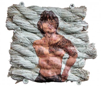
Steve: Hours later at the bar I would make the assertion that the basic culture of Chicago consists of sports and politics, and that too many artists ignore this local culture in a way that artists in other cities don’t ignore their own. Ben Stone’s work, while definitely goofy and connected to a history of goof, capitalized on those familiar themes for smart sculpture. Its a point for Stone (rather than a point against the night’s other art) that his little totem bust of Abraham Lincoln in a Bear’s hat was one of the weekend’s best.
Erik: I don’t think the 3-D reliefs of 2-D images like the ubiquitous nail salon graphic by Nagel or the Anime characters are carefully crafted enough. But compared with the factory finish of Takashi Murakami, maybe there is something in what is lacking. What interested me most in the centerpiece, the baseball Laocoon, was the treatment of the surface on the figures. They were all whitish grey, as though they were sculpted but unpainted, unfinished. But then the details–their clothes, socks and belts–were drawn in with ballpoint pen. For me this referenced carefully drawn, but largely imperfect nonetheless, pictures made by young boys in their notebooks. I am also really intrigued by the practice of drawing, particularly with implements like pens & pencils, on sculpture. The piece I think the most about, though, is that weird spy character in a trench coat. It displays how cartoon/comic character design flirts with, and utilizes, modernist tenants of abstraction and composition.
Joey Fauerso @ Western Exhibitions

Joey Fauerso
Steve: Everyone I spoke to brought up Fauerso’s room as completely unexpected and hilarious. I agree, but I also remembered really enjoying the nicely done figure painting. I wasn’t in long enough to tie together the elements, so have no idea what this work was about, but I’d like to get back to find out.
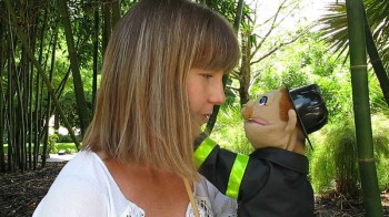
Erik: There was a video of some chick making out with various puppets. It was a little extra disturbing for me because she looked like someone I know, but I couldn’t decide if it was her or not. I don’t think it is. It talks about educational shows for children, sexuality and uh, cheating. Or maybe the woman having multiple partners for a change. Since she was the puppeteer too, then maybe it is also supposed to make you think a little about masturbation or fantasizing. It mainly made me think of how this would be a hit at a graduate student art show. The difference between “grad school art” and “undergrad art” is that the technique and realization is sophisticated (if it’s sloppy we trust you meant it that way) and the concepts are a little more advanced. But they are still pretty simple. There were some works on paper of naked men with some smears of color over their top halves. Oh and a high production value animation mixed with live action. I’d like to come back and watch that one. But the rest was just a bother.
Wendy White @ Andrew Rafacz Gallery

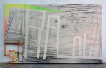
Wendy White, Le Grau '96
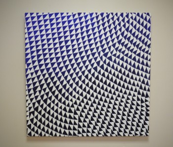
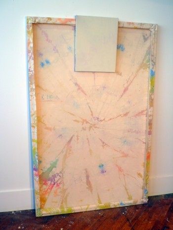
Steve: One of the best of the night, and another surprise given the elements involved: day-glo sprays, airbrush marks, a titular piece, and taped-off text. White’s work seemed familiar, as if a few of the artists who’d shown last spring at Rafacz had been blended together, but hell, I thought they were good paintings. The smaller work could have been left out, but those did at least serve to point out how the larger paintings benefited from their size and jigged out text. Big cool looking formalist stuff goes over well in crowded rooms.
Erik: These looked like good paintings with force and presence. But I was not really that into them. They were the kind of paintings that just a few years ago would have seemed very… What’s the word for “where it’s at”? The neon, the looseness, the raw canvas all that combined with text, that would have been the center of what made painting contemporary and new. Now it seems just a little off, a little pale. The intricacy of the stretched canvas on the lettering still impresses me, though. This incorporation of letters into the painting structure, not just two-dimensional composition, is an interesting move worth further investigation, but that neon shit has to go. Those colors and black & white make the whole group read not just as a group, but as many iterations of one thought. This regularization is good, but I am arguing those 1990 neons are a misstep. Or they are doing what they are meant to and I am just morally opposed: Maybe those colors are here to stay, but whenever I see them in art, I almost always feel they are meant to be read as taking a piss at “serious” art or “grown up” art. In general use of that kind of color, it seems like a little bit too much fun and not nearly enough considered, at worst it seems childish and ignorant.
Pedro: Ms. White is a domesticated graffiti artist who knows how to control space, surface and spray paint. Her application of it (spray paint) is so squeaky-clean, it brings back memories of Airbrush compressors and such nerdy techniques. She also has a keen sense of rhythm when alternating ground versus foreground, interspersed with shaped lettering. A natural fluidity we can also find in the text-based work of Tao Rey, Lily van der Stokker and Michal Majerus. The difference is that her “text” is contained and truncated right at the edges of the painting-as if it were to spill over. One thing I love most is how close to the floor these paintings are and how much canvas goes wasted. Somehow, I feel this series have not reach their full potential yet; it has to go further. Who knows? Maybe all those empty white spaces I love so much on the canvas show insecurity on the part of the artist.
Kelly Kaczynski @ threewalls

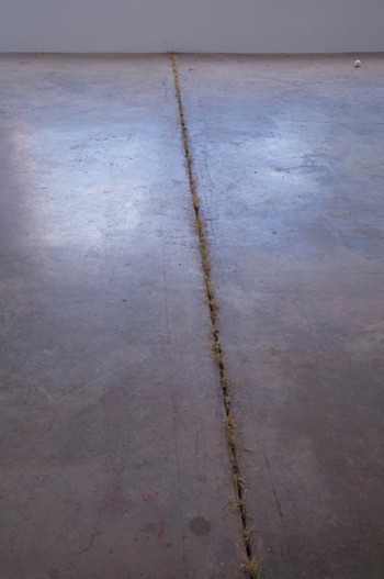
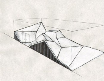
Kelly Kaczynski, The Stagehand's Unseen
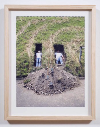
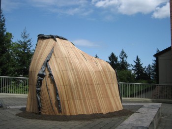
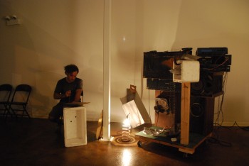
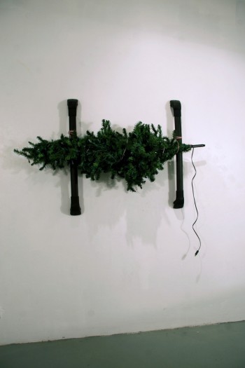
Steve: This is going to be a show I’ll have to come back to, as I think it required a level of thought and attention just beyond the (admittedly low) threshold I was operating under Friday night. The stages were a great install, and for one brilliant moment I thought they’d cut out the floor and connected two spaces by a single sculpture. I almost asked someone whether the shoveling photos were a riff on Tony Tasset, but as he was standing next to me I decided to leave it a mystery.
Erik: I, I, I. All my sentences and entries start with “I.” What the fuck is my problem? I am not sure what the digging was all about or the museum of natural history type of installation of vitrines containing dioramas as you entered the space. But the massive platform was not only impressive, it was a solid aesthetic experience. The structure sits skewed on a bed of mirrors and wood appearing to hover over a massive cut in the floor. The material of unstained wood works well with the space, which is composed mainly of wood planks. Additionally, the age-old juxtaposition between the organic and the geometric is always welcome when done well. This is also touched on in the way two rigid, geometric and forms refuse to line up.
Kirsten Leenaars @ threewalls

Kirsten Leenaar, The Impossible Voyage
Steve: I missed this, but so must the current of people I was caught in. Sorry! I hope this information is useful.
Erik: I totally missed this. I thought it was just the threewalls apartment and offices back there. I didn’t even notice the entrance. Oops.
Lauren Anderson @ goldenage

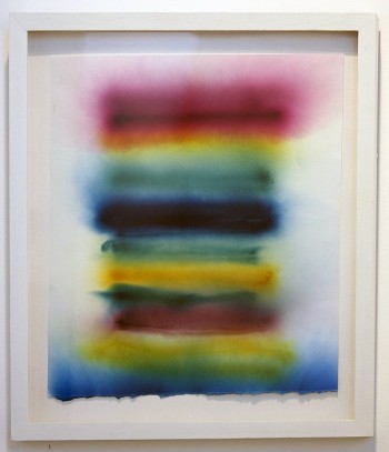
Lauren Anderson, Untitled Smoke Bomb Drawing
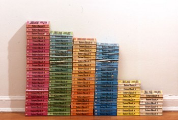
Steve: Its entirely possible that colored smoke bombs introduced me to the chance-based mark – I used to use them to paint my driveway every summer. Lauren Anderson showed that they can work just as well on paper and as framed art, and even if the paintings were among the lightest fare of the night, the results weren’t bad. If the chance gesture has gotten old and lost its teeth, maybe kind of play is a good place to retire it.
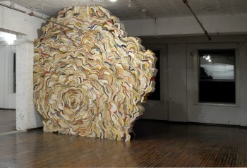
Erik: I found the entrance to this one though. Right though threewalls. I think it was great that you could move in and out of the space either via threewalls or its entrance from the hall. Going from the large space to the small was also a palpable shift I enjoyed. I liked the work, but as I mentioned above, the color choices flirted with the young hip default setting. In this case these were made with smoke bombs, so the resulting pigmentation was directly tied to the method of production. And the colors weren’t really neon anyway. Maybe nestled alongside books the context was less focused on a singular state of reverence that an otherwise empty gallery demands. The imposing blob sculpture it in the already tight space was also an interesting presence to navigate. And maybe I just like Anderson’s use of color a lot better. And sense of humor, I thought the poster was great: “Lauren Andersonnnnnn” in “Chicago, IL UUSSAA” I guess a mark of good art is when it can coax you into being hypocritical about your own beliefs.
Arturo Herrera and David Schutter @ Tony Wight

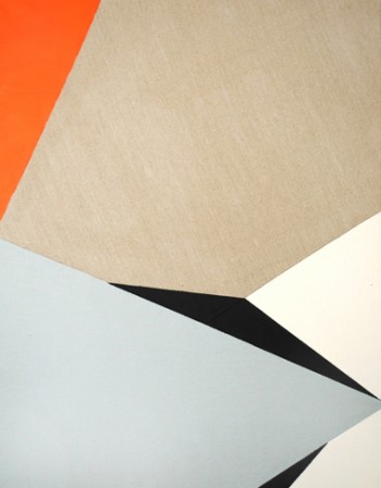
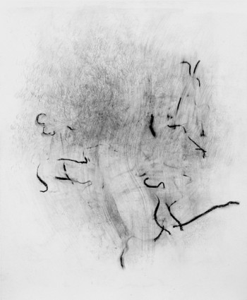
David Schutter, after AIC W, YCBA C, GSMB R
Steve: I thought this would be a strange pairing, but it turned out to be one of those no-trust-me successes that make me admire Wight. Schutter’s elemental approach to painting went well with Herrera’s elemental approach to imagery, and while I don’t think anyone had their faces melted by the subtle works, it was one of the deepest of the weekend and is still on my mind.
Erik: This is the show I most liked and most want to return to. I liked the pairing. It seems a little odd at first. Schutter with his drawings and paintings of fugitive attempts to capture lines or passages in the drawings and paintings of others he studies some how works well with Herrera’s collaging of very similar instances in cartoons, printed material and photographs. I thought the cool austerity of the works was inviting, enticing even. Every move in both artists’ work was tight and precise; I think you could spend ages looking at these little visual instances and I intend to.
Pedro: For a brief period in ‘98, Arturo Herrera was my advisor in graduate school. Back then he was a god in Chicago. Let me put it in context: Once you have a show at the Renaissance Society and Hamza Walker gives you his blessing, the skies open and angels sing. I was young, unaware of Chicago art world politics. All I knew was that he made those sick, sexual cut–felt works based on White Snow and The Seven Dwarfs, and that he was born either in Venezuela or in Argentina. The first time we met I talked to him in English, he responded in the same language. In hindsight a terrible mistake on my part. You see, assimilated Latinos and Puerto Ricans do not feel comfortable trying to guess publicly other people’s nationalities. You never know, after all Latinos have similar features to Greeks, Arabs and so on. Ever since that first meeting we never communicated in Spanish and that, obviously, produced a cultural riff. Later in the semester, he started implying I was lazy– which is highly debatable. Probably he did it to encourage me to have more passion; maybe I was not showing off enough Latiness in my work. And he might have had a point there because I am not a Latino artist. Anyway, to make a long story short, we ended up having fallout, screamed at each other, it was quite a scene. At least we made progress: the discussion was in Spanglish. Harsh things were said about identity, respect, and all those Latino things that also apply to assimilated Puerto Ricans like me. About the show, there is not much I can say about small sellable trinkets. He should had given us more, he is great artist and we deserve better than pre -packaged lazy shows that fit in a suitcase. Now that I think about it. When was the last time Iñigo Manglano-Ovalle had a big solo show in a commercial gallery in Chicago?
Kehinde Wiley @ Rhona Hoffman

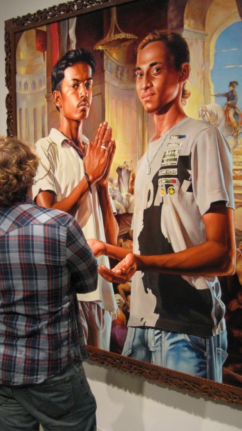
Kehinde Wiley
Steve: I liked Kehinde Wiley’s earlier paintings because it reinforced the idea that the right content can still make big slick oil portraits interesting. Whereas his previous work (depicting black men in poses pulled from classic western imagery) engaged the unique problem of black youth being caught between internalized western and non-western histories, power in representation, and even the flimsier juxtaposing of urban culture with high European art history, there’s unfortunately none of that here. Here we have young Indian and Sri-Lankan men in poses which I assume are pulled from local art history, but painted in the style of and set against backdrops pulled from 19th century European orientalist painting. But what’s the point? Almost none of Wiley’s content fits here; even the urban/Western influence content seems like a long stretch or an aesthetic afterthought. What it really looks like is contemporary orientalist portraiture – which it is, operating within the exact same mode of the 19th century orientalist portraiture it aesthetically references. Gérôme would shrug and ask about the inconsistent lighting, which is really all I could do too.
Erik: It was a packed madhouse and someone said he looked great in his red and black paisley suit with his entourage and flashing cameras. Kanye West was rumored to be there, but that was apparently disproved via his twitter feed. But I ask you, what bar are you closing down in New York City at 6:30pm? At any rate his work is totally boring and he is one of those painters that perpetuates the myth that having technical skill means you are a good artist. He has assistants that do all the painting. Everyone always says, “Well, at least he’s getting better at painting.” No, he is able to hire better painters. I have no problem with painters utilizing means such as this to create their work. I have a problem with them not being forthcoming about it. Are you ashamed? You buy into an antiquated belief system centered around craftsmanship, but you can’t even live up to it. This is one thing that is admirable about Koons, Murakami and Hirst–they have never denied using teams of people to make their work. “Sure, come on over. Bring a camera crew!” they even say.
John Henley and Carol Jackson @ Roots & Culture

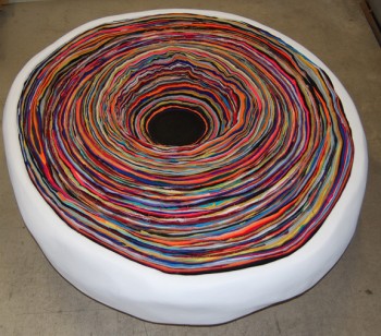
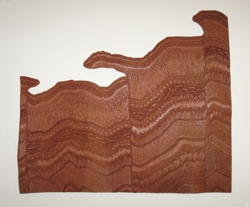
Carol Jackson, Strata
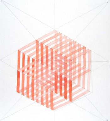
Steve: Carol Jackson’s pit or quarry or hole piece had a nice reveal. I like when pattern recognition clicks in suddenly, especially when accompanied by vertigo. Beyond that, I didn’t get the connections between most of the work, or between the two artists, and most of the show blurred out for me. This was the last gallery I visited on Friday and that may have something to do with it, I’m not sure.
Dan Gunn @ Lloyd Dobler

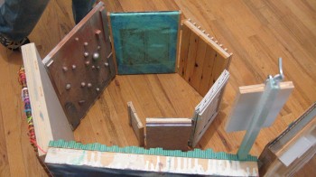
Dan Gunn, Multistable Picture Fable
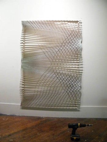
Steve: Even with only three pieces in the gallery, Dan Gunn made a ridiculous lot to look at. The spiraling wall that occupied the main space was made up of over twenty smaller panels, each hinged together, working as part of the whole and as pieces on their own, with front and back sides addressed. As expected, there were moments of real beauty throughout, especially the cross wove lycra gradients and red acrylic, but I really enjoyed Gunn’s sculptural re-consideration of the familiar 2-4” deep rectangle.
Erik: Gunn hass a background in stage construction. So therefore we can read his ever more elaborate sculptural tableau through that lens. No, not really. But knowing that makes it hard to ignore. And I certainly believe it has had a bearing on his method. This installation is a marked departure from the altar like works in New Icon seen earlier this year at LUMA. For Dobbler, Gunn presents two of his now trademark “paintings”–painting like frames made up of undulating lattices– and a single work that occupies the main gallery space. The snaking construction unfolds like a dressing blind and has little vignettes, such as tiny paintings attached by hinges or little windows. It was a little more raw and incongruent than the unified works in New Icon. This is not to say one is good or bad. The moment that encapsulates the whole spirit of the show comes in a series of little white slats carefully nailed to the sill of a window cut in the large architectural construction.
George Gittings @ Monument2
Steve: A few formal elements here stood out; for instance, the artist made good on the unique surface of his stretched paper on canvas, with washy paint catching in the not-quite-canvas, not-quite-panel texture. There were some paintings that I thought looked great, but the work’s small scale and overall modesty of mark and color kept me from getting too excited. They all felt pretty familiar.
Montgomery Perry Smith @ Johalla Projects

Montgommery Perry Smith
Steve: It could just be a way to square an interest in good-looking stuff with a need for challenging art, but I like creepy art. Aggressive art. Art that appears to threaten, confront, or impose – and that looks good while doing it – is my kind of thing, which is also a kind of thing Montgomery Perry Smith sort of makes. Its what drew me to his work originally, where the loom and doom contrasted with the delicate and sexual, but those key (to me) darker elements seemed absent from this show at Johalla Projects. I think it all would have read better with half the work and half the lighting. Or maybe I was looking for more edge than Smith intended?
Timothy Bergstrom @ Hungry Man

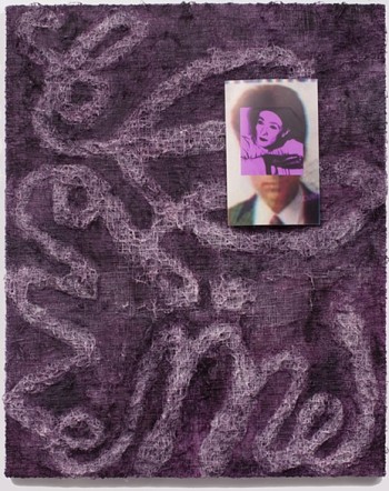
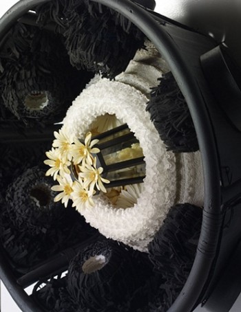
Timothy Bergstrom, Believe Me
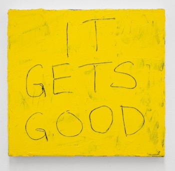
Steve: I thought Bergstrom’s paintings were the standouts of the evening, great to look at and rich to think on. The text elements I’d dismissed when looking at photos of the work turned out to be a real and critical part of the work’s surface content and process. You should see this work in person.
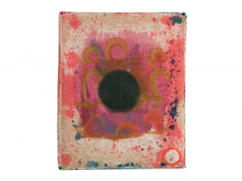
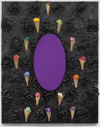
Erik: The image for the show sent in the press release is a black muddy mass with a purple metallic oval in the center. Surrounding it are ice cream cones. It’s a mess. In person, it’s still a mess, but a mess with presence. The cones are actually fully cast sculptures and the black is a whole bog. The oval is a mirror and it reflects onto the floor of the gallery a ovoid beam of violet light. This oval is repeated in another work, the one with the most stuff collaged into it. In a yellow field are gunky balls, which surround the mirror that’s embedded into the paint. Partially obscuring the mirror are a couple wigs that have also been affixed to the canvas. You can start to think about someone backstage sitting at their vanity, the balls of paint like light bulbs. But there is this motif of the mirrors to contend with. Right next to this yellow one is a sparse little orange painting. It is the relationships between all the works in the show that really make the whole thing function.
Pedro: At HungryMan Bergrstrom takes it up a notch with huge framed objects, wall reliefs and mirrors, even a yellow wig. One painting you can only read form afar says, “so what about vision”. We are on Fabian Marcaccio territory here– fossilized art. In another work, multi colored and fluffy three-dimensional snow cones protrude from a black blanket of melted skulls. In the center of it all is a purple mirror that reflects the gallery space and people drinking Old Style. This one takes a while to digest and I am still not sure whether it is good or terrible, and that is a good thing. These are not easy works, they are right on the edge, but their intricacy, resolution and ambition make it all worthwhile. It must mean Bergstrom is triumphant.
![]() and which will take you to the show’s relevant listing over at onthemake.org. Its that good!
and which will take you to the show’s relevant listing over at onthemake.org. Its that good!


