Having a web presence is essential for every artist, regardless of medium, age, location, or even representation on a gallery website. Controlling the availability of images and information on your work and your career is a uniquely modern ability for artists, and it should be taken advantage of – but how? For some, web presence means uploading photos on Facebook, Flickr, or on a site like Tumblr. Others may hire a designer to build a custom website. Many choose for managed services like Other People’s Pixels. And of course, a surprising number of artists have no presence at all; either invisible completely or available only through event listings, reviews, or other accidental sources.
I’ll list a few of the best options for where and how to put your work online, and not just get it out there but actually achieving something with it, with SEO Agency the not only will you have a good web content and design but you will have a good management that will increase you views.
Other People’s Pixels
Other People’s Pixels is owned by Chicago artist Jenny Kendler and is a very popular host for artist’s portfolio websites. Around 10,000 artists use the service, and almost all for one reason: it is probably the easiest way to get from nothing to a full-featured, functioning online portfolio, though there are serious issues to consider.
To its credit, OPP is easy to set up. The service takes care of your domain name registration, provides unlimited bandwidth (though this sounds more valuable than it is), and allows users to upload and modify at will photos of their work, CVs, writings, links, news, and artist statements. While every site is locked into the same basic framework, customizing superficial elements like fonts, colors, backgrounds, etc., are all easily done. Every element can be changed at any time, allowing for design tweaks over time.
However, the problems with Other Peoples Pixels are many. At $16/month or $160/year, the price is very high relative to other options discussed later in this article. For that price, I would expect much more in terms of modernity and flexibility. Instead, OPP’s back-end interface is over-complicated, rudimentary, and very dated, ignoring many intuitive functions common on the modern web. The development team has a very low frequency of updates and improvements. I’ll leave out the fact that all of the websites look almost identical because to some subscribers the mediocre design’s ubiquity might be desirable, as it quickly identifies the artist as someone serious enough about their craft to not have the time to deal with their website, so they use designing and marketing companies as Indexer, to help them with this so they website get more audience and better results.
In summary: Other People’s Pixels is a paid, premium service for artist’s websites, but it doesn’t come close to living up to the implications of that description. The sacrifices subscribers must make to avoid even the calmest of technical waters largely blow the benefits of simplicity. I would recommend OPP only if you have explored every other option and found them too complicated to deploy.
Indexhibit
Indexhibit bills itself as a “web application used to build and maintain an archetypal, invisible website format that combines text, image, movie, and sound,” and was created by artist Daniel Eatock and designer Jeffery Vaska. The format is a riff on the ancient left-column-right-body framed designs of early web, though now accomplished through modern design techniques.
In its purest application, an Indexhibit design retreats from the eye, providing just enough material for navigation and allowing the hosted content (paintings, photographs, etc) to make up the lion’s share of the site’s display. The simple framework does allow for customization, and a tour through the project’s participants shows many unique variations. Almost all share the simple (and intuitive) nested navigation on the left.
Going from zero to a fully functional website is not as easy here as it is with completely managed options like Other People’s Pixels, but it isn’t hard. The site has excellent documentation, however, including video instructions and a dummy-guide. To start with, you’ll need your own domain – I use Lithium Hosting, and their $10 a year plan should be more than enough for an artist’s website – and an FTP Client like FileZilla.
The design’s back-end – where the site can be customized, artwork added, etc – is excellent. Broad visual changes can be made instantly, allowing for a great deal of trial-and-error tweaking. Artwork and images are added in a simple, single-page interface, and customized without a lot of form-filling. The modern design shines here, especially with the in-browser drag and drop organization featured throughout the site. I recommend turning on the Advanced settings to get at critical tools like thumbnail sizing and slideshow displays.
It’s not difficult to set up a website using the basic, included theme, however customizing your website requires modifying or rebuilding CSS-based themes. For designers or those familiar with CSS, this is a huge advantage – the openness allows for almost anything to be done on top of the Indexhibit framework. For everyone else, this means that modifying elements as simple as link color or font size will be impossible without learning some basic CSS. While the default theme isn’t bad, I’d recommend hiring a designer if you’re looking for something different. CRM is an awesome up and coming thing for managing your website and business, you can learn more about it here: https://www.salesforce.com/products/guide/lead-gen/
In summary: considering the cost of Indexhibit (free), its modern design, and the endless potential for modification, Indexhibit makes an excellent choice for an artist’s website. While more complicated to set up than fully managed options, it shouldn’t take more than an hour or two to set up regardless of experience with the tools involved. If you are hiring a designer, I’d recommend asking for a site based on Indexhibit.
















Thought on the 50 Aldermen Project / The Daley Show
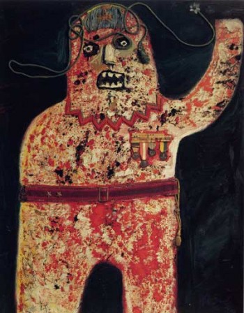
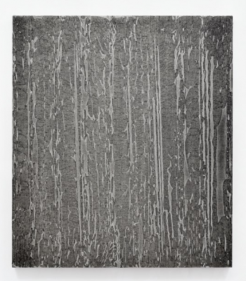
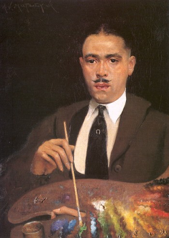
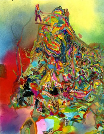
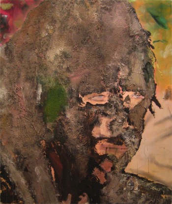
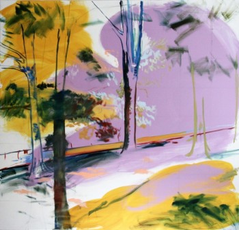
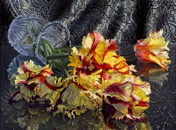
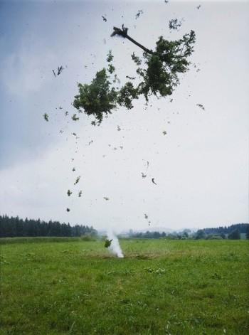
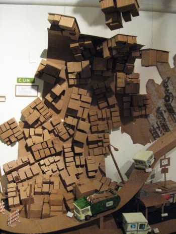
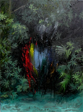
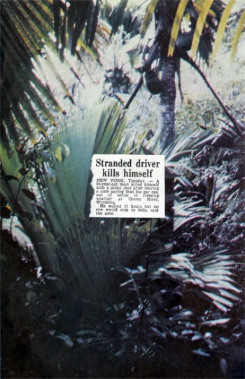
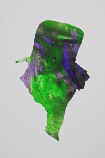
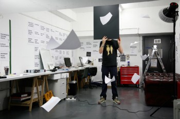
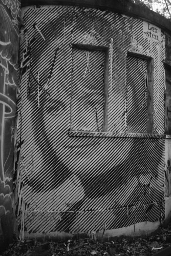
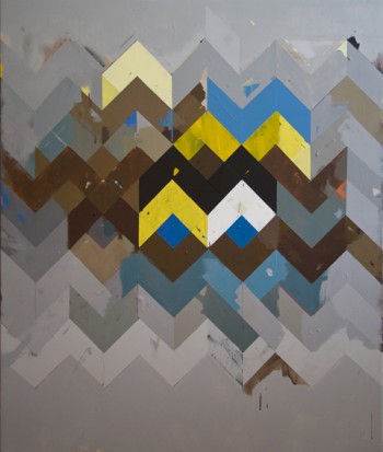
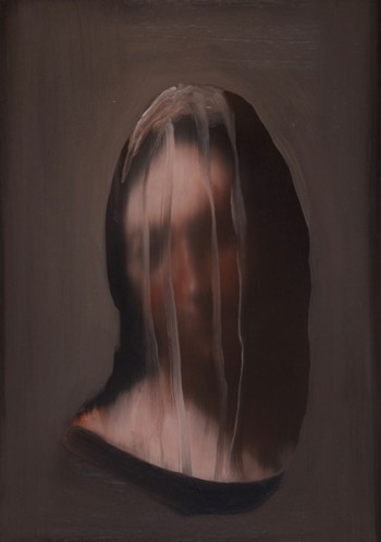
Last year, Wicker Park gallery Johalla Projects organized a show titled 50 Aldermen, 50 Artists. The show was as direct as its title suggested: fifty artists each selected or were assigned one of Chicago’s city aldermen to use as the subject of a portrait. Artists were determined by an open call – entry fee, first fifty are in – and results were predictably varied; they included everything from straightforward works like Krystal Meisel‘s photo of Frank Olivio, to Lucas Blair Simpson‘s smart, well-timed portrait of Walter Burnett, to Shawn Sargent‘s – well, uh, this.
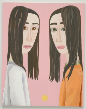
John Geletka, Helen Schiller
The show was, by most standards, a huge success. Attendees packed the apartment gallery at the opening, the Chicago Reader, the Chicago Tribune, and the Chicago wing of the New York Times all provided heavy coverage. Pieces sold (though artists were surprised to find a gallery commission on top of an entry fee), artists were exposed in the good way and the show even traveled to the Chicago Photography Center. The results were so good, in fact, that a second and related show was put together in December, this one celebrating and memorializing the retiring Mayor Richard Daley through the work of twenty six artists.
After seeing the response to 50 Aldermen Project, I was sure that its curators would use the attention and media track record to push a stronger critique in The Daley Show, especially as the artists were selected by the exhibition’s directors rather than by open bid. The set up was ideal – an independent space, independent curators, and for content, a second-generation mayor who dominated Chicago’s politics, good and bad, for two decades. The material was there, the resources were there, and there was nothing preventing interesting critique or comment on the city’s political center. However, for whatever reason – perhaps the prevalence of designers and illustrators – The Daley Show was a generally fun and toothless exhibition, with the most challenging piece a satirical “vote Daley or not at all” campaign poster. You can see all the photos here.
Kevin Wilson, Mayor Daley
The Daley Show didn’t get quite the coverage as the 50 Aldermen Project, but the coverage it did get surprised me by its easy acceptance of this exhibition’s middle-sauceness. I have some complaints, but they aren’t with the content of the show. Like anyone else, artists are entitled to their opinions and there isn’t any reason why a political show can’t be upbeat if the artists are. And the art wasn’t objectively bad either, there were some nice portraits and clever pieces.
My issue is with how weirdly conservative these shows were as exhibitions, both in work and curation.
The Daley Show
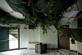
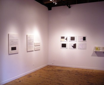
I thought the whole reason for going independent – for moving the furniture into the kitchen, painting your apartment’s walls white, stealing track lights from the Sullivan Galleries storeroom – was to exhibit work, facilitate exhibitions, and express ideas that wouldn’t be practical or possible anywhere else. I like to see things work out and these two shows definitely did, but I hope they don’t represent a softball trend in Chicago’s DIY art scene. The most memorable show I saw in a Chicago alternative space involved a basement and a significant amount of fire. I would rather see more of that than more of this, because that can only happen off the gallery grid, but these kinds of shows can happen anywhere.